IMDb RATING
7.2/10
8.3K
YOUR RATING


An exploration into typography, graphic design, and global visual culture.An exploration into typography, graphic design, and global visual culture.An exploration into typography, graphic design, and global visual culture.
- Awards
- 3 nominations total


Featured reviews
A documentary about a typeface? For those of us who take interest in such things, of course! But if you're one of those who never bothers to change the default font in your Word documents from Times New Roman, then I'd recommend you stay away from this film altogether.
Unfortunately, even those who are keenly aware of typefaces may find this movie disappointing. My main criticisms:
1. It spends long sequences showing us examples of Helvetica signage used in various contexts. Some are elegant and clean, many are torn old posters, ragged pieces of letters peeling off walls, etc. These sequences were artistic and okay at first, but maybe after the fourth one, you find yourself reaching for the fast-forward.
2. It spends the vast majority of its time in interviews with various designers discussing their impressions of the font's "meaning" or its impact in the history of design. This should have been perhaps 30% of the film, instead it is closer to 80%.
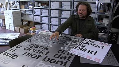
3. It doesn't spend enough time looking at the technical details of the font. There are occasional off-hand references by some of the interview subjects to various features of certain letters, but even those segments are not illustrated. I would have loved to see a side-by-side contrast between Helvetica and similar sans-serif fonts used earlier, or perhaps others created since then. In one sequence, we catch a glimpse of one of the original large-scale drawings for one of the letters; I would have enjoyed seeing more of those, larger on the screen, and with explanation of how the various parts work in relation to one another.
With its current affective emphasis, this would have been an acceptable 45-min. documentary, but at an hour and a half, it is far longer than it needs to be. I hoped to walk away with an understanding of what made Helvetica uniquely popular, but that was never clearly shown in any way.
Unfortunately, even those who are keenly aware of typefaces may find this movie disappointing. My main criticisms:
1. It spends long sequences showing us examples of Helvetica signage used in various contexts. Some are elegant and clean, many are torn old posters, ragged pieces of letters peeling off walls, etc. These sequences were artistic and okay at first, but maybe after the fourth one, you find yourself reaching for the fast-forward.
2. It spends the vast majority of its time in interviews with various designers discussing their impressions of the font's "meaning" or its impact in the history of design. This should have been perhaps 30% of the film, instead it is closer to 80%.
3. It doesn't spend enough time looking at the technical details of the font. There are occasional off-hand references by some of the interview subjects to various features of certain letters, but even those segments are not illustrated. I would have loved to see a side-by-side contrast between Helvetica and similar sans-serif fonts used earlier, or perhaps others created since then. In one sequence, we catch a glimpse of one of the original large-scale drawings for one of the letters; I would have enjoyed seeing more of those, larger on the screen, and with explanation of how the various parts work in relation to one another.
With its current affective emphasis, this would have been an acceptable 45-min. documentary, but at an hour and a half, it is far longer than it needs to be. I hoped to walk away with an understanding of what made Helvetica uniquely popular, but that was never clearly shown in any way.
This movie is brilliant. It's a documentary about the creation of the Helvetica font, sure. But it's also: a musing on the history of modern graphic design. A diatribe (by some) about a font seen as style-killingly ubiquitous. A visit to favorite graphic designs of years past. A reflection about what our fonts say about us.
If you are a graphic designer, you'll love it. If you live with a graphic designer, you'll shake your head and say, "Yup" in recognition. If you don't pay any attention to graphic design, you may think about it just a tiny bit more after seeing this movie. And you will definitely come out of it with SOME opinion about the Helvetica font.
If you are a graphic designer, you'll love it. If you live with a graphic designer, you'll shake your head and say, "Yup" in recognition. If you don't pay any attention to graphic design, you may think about it just a tiny bit more after seeing this movie. And you will definitely come out of it with SOME opinion about the Helvetica font.
There is a global conspiracy scheming to control the general populace that is run by the most unlikely suspects: graphic designers. Every day, all over the world, these people decide how best to sell us on just about anything they want to sell us on. Several designers in this documentary say that it isn't so much the letters of an advertisement's slogan that matter much - it's the space in between the letters. What's so important about the empty space? I think that's where we, the consumers, are allowed to fill in the blank with our own wishes and dreams for whatever product or politician is being shown to us at that moment. But that's not really what this movie is about.
Helvetica is the most commonly used typeface in the modern world. Crate & Barrel, Target, American Airlines, and Energizer are some of the more notable companies that use Helvetica and its derivatives in their corporate logos. Countless other businesses have used it in their advertising. The reason for this is that it was designed for the specific purpose of being as universally acceptable as possible. It is not exactly stylish in and of itself, though many designers have used it stylishly because the typeface is merely a tool of the designer. They can make it stick out or blend in to their liking, and these seem to be the two main schools of thought over the use of Helvetica. The old school designers like it for its simplicity and boldness where newer, younger designers mostly see it as a generic relic from the 60's. One man who calls Helvetica a symbol of conformity and socialism apparently doesn't understand the irony of his using a MacBook at the same time he states this.
This film is focused on the Helvetica typeface - its creation, its purpose, and its uses - but it speaks volumes about the design/advertising industry as a whole. There are thousands of people who are striving everyday to make the average Citizen Schmoe feel a certain way and think a certain thing, to control and exploit our buying and behavioral patterns. They may not all be shilling Tide, but it is alarming to see inside that culture. Like any trend in the art world, Helvetica has gone through ups and downs. It was designed in the 50's as an answer to the kitschy, colorful designs of the era. It was meant to be powerful and grounding, not light and airy. It was used heavily throughout the 60's, but the designers got tired of it and abandoned Helvetica's straight lines for "grungy" design in the 80's and 90's. Since Helvetica was built to have almost no personality, designers started giving their work more of that with handwritten text and goofy designs which would have been considered printing accidents in decades past. In fact, one man actually received praise for a mistake that was made in publishing. So the new designers of the 90's were going wild, the older men shook their heads, and our current generation of designers were learning how to use Helvetica in wild ways. The lifespan of the font has come, gone, and come again, much like leg warmers are bound to someday soon.
The reason Helvetica is still being used today is because it works. People see those solid, strong letters and they instantly feel secure in the idea it's portraying and comforted by its mere presence, which makes it "ideal" to some people for use as public signs labeling streets, restrooms, subways, etc. It's mind control in a font. It's pretty fascinating stuff, to be sure. But be careful out there, readers. Next time you have to choose between Mobil and Arco gas stations, just remember they're both using the safety of Helvetica to lure you in. And then make the decision to go electric.
http://www.movieswithmark.com
Helvetica screened this week at the SXSW Film Festival in Austin, TX where it was very well-received. In a million years it would never have occurred to me to do a documentary on a type font. The film makers somehow came up with the idea of doing a cultural history of the Helvetica font which has become the almost universal default modern font over the past 50 years. Fonts are almost like the air we breathe. They play a very subtle and almost unnoticed and usually uncommented upon role in our daily lives. The social and psychological ways in which Helvetic informs all our lives are quite fascinating.
Helvetica is a humorous film that combines a series of interview clips with a variety of often rather quirky graphic font designers with shot of various street signs and corporate logos. The film provides a great deal of insight into the role of the Helvetica font in shaping Western culture. Helvetica is both entertaining and informative in that it provides great insight into a ubiquitous aspect of modernity about which most of us are completely oblivious. I hope that many people get the opportunity to see this unusual and insightful film, because it opens a fascinating window for better understanding our society. Since versions of Helvetica are also the default font on most computers, many of us type in Helvetica constantly without even realizing it.
As I walked home from the film, I couldn't help noticing that many of the street signs in Austin appeared to be in Helvetica.
Helvetica is a beautifully created documentary about the Helvetica font. Now you might think this is a dry and boring subject (as I did before I saw the film) but it is in fact a fascinating tale of design and it's implications.
I think this is a film for anyone who wants to know what design is all about. Never mind that it's based on the font it is a statement on design in general too.
The interviewed people are all extremely interesting and succeed in conveying their passions and convictions. The video work is convincing too and shows very well how common and you might say oversaturated the world is with Helvetica.
This Film WILL change how you see writing. It teaches how to look for the font and it's influence in writing and advertising.
Great film, definitely a must watch.
Oliver


Did you know
- TriviaGary Gulman does a hilarious sketch about this movie on his comedy album. "Riveting!" - Gary Gulman
- Quotes
Massimo Vignelli: You can say, "I love you," in Helvetica. And you can say it with Helvetica Extra Light if you want to be really fancy. Or you can say it with the Extra Bold if it's really intensive and passionate, you know, and it might work.
- ConnectionsFollowed by Objectified (2009)
- SoundtracksThinking Loudly
Written and Performed by El Ten Eleven
Vopar Music/Go Champale Music
Courtesy of Bar/None Records
- How long is Helvetica?Powered by Alexa
Details
- Release date
- Country of origin
- Official sites
- Language
- Also known as
- Гельветика
- Production companies
- See more company credits at IMDbPro
Box office
- Gross worldwide
- $21,680
- Runtime
- 1h 20m(80 min)
- Color
- Aspect ratio
- 1.85 : 1
Contribute to this page
Suggest an edit or add missing content