IMDb RATING
7.2/10
8.4K
YOUR RATING


An exploration into typography, graphic design, and global visual culture.An exploration into typography, graphic design, and global visual culture.An exploration into typography, graphic design, and global visual culture.
- Awards
- 3 nominations total


7.28.3K
1
2
3
4
5
6
7
8
9
10
Featured reviews
Unrepresented Presentation
This is surely the best documentary I have seen. I use several metrics in this.
A film is almost without exception a story. A documentary is usually presumed to be a found story, an existing one that the filmmaker merely exposes. We come to the thing expecting some coherent story, already formed, the problem having two threads: Can we trust the filmmaker? Does the story resonate? Often a solid position in one mitigates the other.
But real life at least the life I know has no stories that are blunt. Real stories, the ones that weave themselves through the world, are rich, only somewhat visible, immensely intriguing and often educational. I expect to be puzzled. If there are "two sides," I immediately mistrust the teller, because true movement is simply itself.
This film should be celebrated simply because it decides to present a story in its unformed state. We hear from designers young and old, clever and not. Some are geniuses and some see the genius of design and we have no idea which is which. They report profoundly different views on a typeface. Lest we think this is an irrelevant subject, the observations on the typeface are bridged by examples to show how thoroughly it has saturated.
So we are left with the same form as "Ten Tiny Love Stories," perspectives that surround the notion and instead of pulling out the answer, illuminated the mystery. The simple fact is that this is a powerful, mysterious force that makes us do things. The comparison of font design and romance is not misplaced: both somehow relate to the bricks of stories we use in constructing a life or for some of us a fort to protect from life.
So I can recommend this to you. I recommend seeing it with your partner, your real partner. And then sit with them quietly and reflect on the nature of clarity and knowing.
I can criticize this though. There is much that could easily have been said that wasn't.
Its usually presumed that spoken language is quite old and written language a relatively modern technology compromised to make it persist. In this context, type design is merely a matter of style, a choice.
But there is evidence that spoken language predates modern humans and evolved over time through collaborative toolmaking, most particularly weaving and stonechipping. Acts of hands. Shapes -- physical form, with symmetries. Spoken language in this history is itself an adaptation, and written language perhaps closer to the core of how we think. In this history, shapes matter. The process of creating form in story all manner of form matters. The story is how the story is shaped.
We bump against this intuitively. It was why the Macintosh was a giant step forward in the 80's, because storytellers could for the first time be storyshapers (publishers, in the corporate lexicon). And why Microsoft is such an evil. And why type design elements have become so deeply viral. The original features come from carved inscriptions and independently from monks' pens.
Anyway, from that Mac beginning came a focus on type as never before. And several design journals that struggled with the issues spoken about in this film. Pulling them out of print to put on screen should carry some more weight than we have here. I am hoping that some truly talented filmmaker is inspired by this.
The most edgy but still intelligent design and font design journal from the last decades is "Emigre," which you should peruse if this movie intrigues you. Also you might want to check out Darius, who was behind the first designed font.
My typeface is Vendetta.
Ted's Evaluation -- 3 of 3: Worth watching.
"Helvetica" a Typography Tour de Force
I saw this film last night at the Rochester Institute of Technology in the company of hundreds of budding graphic designers, new media specialists, and fans of typography. I found it utterly engaging. It wasn't just a film about a font. It was a clever device used to weave a story around graphic design, the importance of typography in the craft, and the passionate opinions on design in general elicited from this stellar cast of über creative professionals.
I feel that this film has a broad appeal beyond typography aficionados, which is admittedly a small tribe. The passion behind the ideals expressed by the graphic designers is undeniable and infectious.
The film was beautifully put together. The effect of showing the ubiquitous use of this font in cities around the world, with people walking by, buses, taxis, and cars whizzing past, etc. all set to a totally perfect music was wonderful. These vignettes provided transitions between interviews with world renowned designers.
You might have trouble finding a screening of this film but if you see it coming to a theater or film festival near you don't miss it!!
A Highly Unusual and Insightful Documentary
Helvetica screened this week at the SXSW Film Festival in Austin, TX where it was very well-received. In a million years it would never have occurred to me to do a documentary on a type font. The film makers somehow came up with the idea of doing a cultural history of the Helvetica font which has become the almost universal default modern font over the past 50 years. Fonts are almost like the air we breathe. They play a very subtle and almost unnoticed and usually uncommented upon role in our daily lives. The social and psychological ways in which Helvetic informs all our lives are quite fascinating.
Helvetica is a humorous film that combines a series of interview clips with a variety of often rather quirky graphic font designers with shot of various street signs and corporate logos. The film provides a great deal of insight into the role of the Helvetica font in shaping Western culture. Helvetica is both entertaining and informative in that it provides great insight into a ubiquitous aspect of modernity about which most of us are completely oblivious. I hope that many people get the opportunity to see this unusual and insightful film, because it opens a fascinating window for better understanding our society. Since versions of Helvetica are also the default font on most computers, many of us type in Helvetica constantly without even realizing it.
As I walked home from the film, I couldn't help noticing that many of the street signs in Austin appeared to be in Helvetica.
Mildly interesting, but ponderous
A documentary about a typeface? For those of us who take interest in such things, of course! But if you're one of those who never bothers to change the default font in your Word documents from Times New Roman, then I'd recommend you stay away from this film altogether.
Unfortunately, even those who are keenly aware of typefaces may find this movie disappointing. My main criticisms:
1. It spends long sequences showing us examples of Helvetica signage used in various contexts. Some are elegant and clean, many are torn old posters, ragged pieces of letters peeling off walls, etc. These sequences were artistic and okay at first, but maybe after the fourth one, you find yourself reaching for the fast-forward.
2. It spends the vast majority of its time in interviews with various designers discussing their impressions of the font's "meaning" or its impact in the history of design. This should have been perhaps 30% of the film, instead it is closer to 80%.
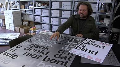
3. It doesn't spend enough time looking at the technical details of the font. There are occasional off-hand references by some of the interview subjects to various features of certain letters, but even those segments are not illustrated. I would have loved to see a side-by-side contrast between Helvetica and similar sans-serif fonts used earlier, or perhaps others created since then. In one sequence, we catch a glimpse of one of the original large-scale drawings for one of the letters; I would have enjoyed seeing more of those, larger on the screen, and with explanation of how the various parts work in relation to one another.
With its current affective emphasis, this would have been an acceptable 45-min. documentary, but at an hour and a half, it is far longer than it needs to be. I hoped to walk away with an understanding of what made Helvetica uniquely popular, but that was never clearly shown in any way.
Unfortunately, even those who are keenly aware of typefaces may find this movie disappointing. My main criticisms:
1. It spends long sequences showing us examples of Helvetica signage used in various contexts. Some are elegant and clean, many are torn old posters, ragged pieces of letters peeling off walls, etc. These sequences were artistic and okay at first, but maybe after the fourth one, you find yourself reaching for the fast-forward.
2. It spends the vast majority of its time in interviews with various designers discussing their impressions of the font's "meaning" or its impact in the history of design. This should have been perhaps 30% of the film, instead it is closer to 80%.
3. It doesn't spend enough time looking at the technical details of the font. There are occasional off-hand references by some of the interview subjects to various features of certain letters, but even those segments are not illustrated. I would have loved to see a side-by-side contrast between Helvetica and similar sans-serif fonts used earlier, or perhaps others created since then. In one sequence, we catch a glimpse of one of the original large-scale drawings for one of the letters; I would have enjoyed seeing more of those, larger on the screen, and with explanation of how the various parts work in relation to one another.
With its current affective emphasis, this would have been an acceptable 45-min. documentary, but at an hour and a half, it is far longer than it needs to be. I hoped to walk away with an understanding of what made Helvetica uniquely popular, but that was never clearly shown in any way.
Fonts as social witness
The one bad review notwithstanding this is an honest, insightful film about the most ubiquitous of fonts, Helvetica. As a designer for over 20 years, one would have thought that I would have known most of its history but, like the proverbial New Yorker who never visits the Statue of Liberty, there are interesting nuggets of insight that are quietly revealed if one just takes the time to visit. Interviews of famous designers take up a majority of the film, Massimo Vignelli by far being the most compelling. Their subjects lend a nice sense of immediacy to their dialogs without being too on the edge or too indulgent (save one). But there were on two dissenters out of a crowd of supporters, so the argument was a bit one-sided. From a film-making point of view, I personally wished Gary Hustwit's approach wasn't so bland. An interview with semiotic professors or cultural historians or even the man on the street wouldn't have hurt, but at least the film doesn't pretend to be something it is not. Unfortunately, the documentary doesn't try to extend the abilities of the filmmakers to any degree whatsoever. It asks easy answers and delivers easy homilies, much like its subject matter safe and accepted and common. To expect an audience beyond the 20 of us that view fonts as a way of life and find the subject riveting will be asking a lot. Is Helvetica the greatest font every designed? No, absolutely not. Is it the one of the most influential? Undoubtedly. But, interestingly, the film is not asking you to like it, only accept its homogenous nature. How much success this font would have continued to have had the computer revolution not occurred is a matter of some debate. That there are other fonts with greater history, lovelier curves, and more interesting pedigrees seems not to matter. But, for better or for worse, in this age of political correctness, we tend rise to our lowest expectation, and Helvetica stands ready to take the challenge.


Did you know
- TriviaGary Gulman does a hilarious sketch about this movie on his comedy album. "Riveting!" - Gary Gulman
- Quotes
Massimo Vignelli: You can say, "I love you," in Helvetica. And you can say it with Helvetica Extra Light if you want to be really fancy. Or you can say it with the Extra Bold if it's really intensive and passionate, you know, and it might work.
- ConnectionsFollowed by Objectified (2009)
- SoundtracksThinking Loudly
Written and Performed by El Ten Eleven
Vopar Music/Go Champale Music
Courtesy of Bar/None Records
- How long is Helvetica?Powered by Alexa
Details
- Release date
- Country of origin
- Official sites
- Language
- Also known as
- Гельветика
- Production companies
- See more company credits at IMDbPro
Box office
- Gross worldwide
- $21,680
- Runtime
- 1h 20m(80 min)
- Color
- Aspect ratio
- 1.85 : 1
Contribute to this page
Suggest an edit or add missing content