IMDb RATING
7.2/10
8.4K
YOUR RATING


An exploration into typography, graphic design, and global visual culture.An exploration into typography, graphic design, and global visual culture.An exploration into typography, graphic design, and global visual culture.
- Awards
- 3 nominations total


7.28.3K
1
2
3
4
5
6
7
8
9
10
Featured reviews
A Highly Unusual and Insightful Documentary
Helvetica screened this week at the SXSW Film Festival in Austin, TX where it was very well-received. In a million years it would never have occurred to me to do a documentary on a type font. The film makers somehow came up with the idea of doing a cultural history of the Helvetica font which has become the almost universal default modern font over the past 50 years. Fonts are almost like the air we breathe. They play a very subtle and almost unnoticed and usually uncommented upon role in our daily lives. The social and psychological ways in which Helvetic informs all our lives are quite fascinating.
Helvetica is a humorous film that combines a series of interview clips with a variety of often rather quirky graphic font designers with shot of various street signs and corporate logos. The film provides a great deal of insight into the role of the Helvetica font in shaping Western culture. Helvetica is both entertaining and informative in that it provides great insight into a ubiquitous aspect of modernity about which most of us are completely oblivious. I hope that many people get the opportunity to see this unusual and insightful film, because it opens a fascinating window for better understanding our society. Since versions of Helvetica are also the default font on most computers, many of us type in Helvetica constantly without even realizing it.
As I walked home from the film, I couldn't help noticing that many of the street signs in Austin appeared to be in Helvetica.
"Helvetica" a Typography Tour de Force
I saw this film last night at the Rochester Institute of Technology in the company of hundreds of budding graphic designers, new media specialists, and fans of typography. I found it utterly engaging. It wasn't just a film about a font. It was a clever device used to weave a story around graphic design, the importance of typography in the craft, and the passionate opinions on design in general elicited from this stellar cast of über creative professionals.
I feel that this film has a broad appeal beyond typography aficionados, which is admittedly a small tribe. The passion behind the ideals expressed by the graphic designers is undeniable and infectious.
The film was beautifully put together. The effect of showing the ubiquitous use of this font in cities around the world, with people walking by, buses, taxis, and cars whizzing past, etc. all set to a totally perfect music was wonderful. These vignettes provided transitions between interviews with world renowned designers.
You might have trouble finding a screening of this film but if you see it coming to a theater or film festival near you don't miss it!!
Watch and learn what our fonts say about us
This movie is brilliant. It's a documentary about the creation of the Helvetica font, sure. But it's also: a musing on the history of modern graphic design. A diatribe (by some) about a font seen as style-killingly ubiquitous. A visit to favorite graphic designs of years past. A reflection about what our fonts say about us.
If you are a graphic designer, you'll love it. If you live with a graphic designer, you'll shake your head and say, "Yup" in recognition. If you don't pay any attention to graphic design, you may think about it just a tiny bit more after seeing this movie. And you will definitely come out of it with SOME opinion about the Helvetica font.
If you are a graphic designer, you'll love it. If you live with a graphic designer, you'll shake your head and say, "Yup" in recognition. If you don't pay any attention to graphic design, you may think about it just a tiny bit more after seeing this movie. And you will definitely come out of it with SOME opinion about the Helvetica font.
Fonts are as exciting as they seem
At its core Helvetica is a documentary about the creation and widespread use of the typeface of the same name. If that sounds boring to you, well guess what, it often is.
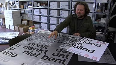
The film, directed by Gary Hustwit, begins with the birth of the typeface. It was created in 1957 by the Swiss with the hope to create a "perfect" sans-serif typeface. As a side note, a serif is apparently the little "feet" type accents that are on letters of certain typefaces, for example Times New Roman is a serif typeface. The film speaks with several type designers, a profession that I was unaware of, including the designer of Helvetica. Once the viewer has been given an adequate background on the typeface itself, the film begins to change. It wanders away from the typeface itself and becomes a documentary about graphic design. Graphic designers express both their love and hatred for the typeface as well as its effects on the larger world of design, becoming more of a film about modernism and post-modernism as it applies to this world.
Throughout the film, the director goes out into the world to shoot different signs and postings that utilize Helvetica. At the beginning, this is intriguing, often surprising the viewer with just how often this single typeface is used. However, as the director employs this technique more and more often, to the point where it seems built into the transitions, it becomes annoying. By the end, I felt like I was just being shown the same images in a film that no longer was truly just about the typeface itself.
If I were a graphic designer I may have found this film more intriguing and interesting, but sadly, this is not the case. It is shot well and the interviews seem to give a balanced opinion on the use of the typeface, but as a film, it is stretched thin, feeling overlong at its lean 80 minutes.
Fonts as social witness
The one bad review notwithstanding this is an honest, insightful film about the most ubiquitous of fonts, Helvetica. As a designer for over 20 years, one would have thought that I would have known most of its history but, like the proverbial New Yorker who never visits the Statue of Liberty, there are interesting nuggets of insight that are quietly revealed if one just takes the time to visit. Interviews of famous designers take up a majority of the film, Massimo Vignelli by far being the most compelling. Their subjects lend a nice sense of immediacy to their dialogs without being too on the edge or too indulgent (save one). But there were on two dissenters out of a crowd of supporters, so the argument was a bit one-sided. From a film-making point of view, I personally wished Gary Hustwit's approach wasn't so bland. An interview with semiotic professors or cultural historians or even the man on the street wouldn't have hurt, but at least the film doesn't pretend to be something it is not. Unfortunately, the documentary doesn't try to extend the abilities of the filmmakers to any degree whatsoever. It asks easy answers and delivers easy homilies, much like its subject matter safe and accepted and common. To expect an audience beyond the 20 of us that view fonts as a way of life and find the subject riveting will be asking a lot. Is Helvetica the greatest font every designed? No, absolutely not. Is it the one of the most influential? Undoubtedly. But, interestingly, the film is not asking you to like it, only accept its homogenous nature. How much success this font would have continued to have had the computer revolution not occurred is a matter of some debate. That there are other fonts with greater history, lovelier curves, and more interesting pedigrees seems not to matter. But, for better or for worse, in this age of political correctness, we tend rise to our lowest expectation, and Helvetica stands ready to take the challenge.


Did you know
- TriviaGary Gulman does a hilarious sketch about this movie on his comedy album. "Riveting!" - Gary Gulman
- Quotes
Massimo Vignelli: You can say, "I love you," in Helvetica. And you can say it with Helvetica Extra Light if you want to be really fancy. Or you can say it with the Extra Bold if it's really intensive and passionate, you know, and it might work.
- ConnectionsFollowed by Objectified (2009)
- SoundtracksThinking Loudly
Written and Performed by El Ten Eleven
Vopar Music/Go Champale Music
Courtesy of Bar/None Records
- How long is Helvetica?Powered by Alexa
Details
- Release date
- Country of origin
- Official sites
- Language
- Also known as
- Гельветика
- Production companies
- See more company credits at IMDbPro
Box office
- Gross worldwide
- $21,680
- Runtime
- 1h 20m(80 min)
- Color
- Aspect ratio
- 1.85 : 1
Contribute to this page
Suggest an edit or add missing content