Showing posts with label Dwight Gooden. Show all posts

Friday, August 6, 2021

Do You Believe in Miracles?

 Kind of.

This package was waiting for me on my doorstep yesterday:

yes, that is a 1952 Topps #1 Andy Pafko along with 1989 LJN Baseball Talk. Fun Times!


If you cannot read that tiny little print on the label, it came from the glorious Seattle suburb of Redmond WA from a company you might know, COMC.  Remember them?  Well, I requested this package in February and it was scheduled for a May delivery - I doubt you need a calendar to see what today is but I can assure you, it is not May.  I am not saying I completely gave up on ever seeing it but their pandemic combination of horrible customer service and empty promises made me wonder if 2022 was out of the question.  But it did arrive.  They have answered emails faster of late and it was very well packaged when I got it.  You can see a nice tease of the stuff that was on top and I am going to spend the weekend sorting and enjoying the 900+ cards that are inside.  I am not here to praise COMC or bury them right now since the world is still knee deep in madness but I will say to anyone reading this wondering if they will ever see their package: miracles do happen.

Sunday, November 22, 2015

Has anyone ever wondered...

 ...that maybe JFK had it coming?


Forget about who did it or any Oliver Stone conspiracy nonsense and just embrace the notion that things were awful without him but they could have been even worse if he'd stuck around.  Be careful what you wish for is all I'm saying.

Monday, March 9, 2015

Heartbreaking Cards of Staggering Altruism.

       I am going to settle all my draft folder business this month.  This week, specifically, I am going to post the half dozen or so trade posts that are languishing half-written or merely just scanned in.  You can't move forward with things half done. 

First off is a package I got in January of 2013(!) from the very generous Matt of Heartbreaking Cards of Staggering Genius.  I had send him a Mars Attacks 1 of 1 sketch card I had pulled with no strings attached and while he promised reciprocation, I couldn't have expected the haul he would answer with just a few months later:


Three game used cards (that's Dwight Gooden, Jeff Bagwell, and David Wright - he read my wantlists, obviously), a Jose Reyes manu-patch, and a glorious vintage combo card?  Are you kidding me?  How could I have not posted this right away?  I am going to blame my swooning lightheadedness and the winter of two years ago for this oversight.  But, better late than never, thanks Matt!

Saturday, March 1, 2014

Spring Has Sprung (sorta).

       The first of March has brought the first televised Mets spring training game.  I love spring training, don't get me wrong, but it can be kind of a tease.  First of all, I am sitting here in flannel pajamas with a down comforter over me because it is still below freezing outside while the TV is showing me beautiful Florida skies and the announcers are taunting me with 80 degree temperature readings in Port St. Lucie.  The actual games always hint that real baseball is coming but mostly show players you have either never heard of or can't fathom the reason why your team signed them - this is especially true of the Mets year after year (Kyle Farnsworth?!? Really?).  One could kind of compare this to a repack - full of such hope and promise of amusement and profit, yet ultimately not very exciting.  This segues nicely into the fact that I picked up a repack at K-Mart this morning while running the errands I knew I can't run on Monday with yet another monster snowstorm coming.  *sigh*  If I wanted to live in Minnesota I would move to fucking Minnesota.  

So let's take a look at this repack.  First of all, I chose this particular one for two reasons:
 photo rp1_zps19c1c9da.jpg
One, it came in one of those nice hard plastic boxes that I like to keep smaller sets that don't make the binders in.  They are very sturdy and you can immediately see what the cards are, unlike a cardboard box which you have to write on and if you have ever seen my handwriting, the less I have to mark things, the better.  Two, all the other repacks of this ilk this particular morning had a 2008 Topps pack as its promised pack and if I never see another 2008 Topps card it will be too soon.  So even though it has the retiring Derek Jeter on it, the one with the 2006 Sweet Spot pack seemed like the best choice.  Plus, who knows, that is a high end product, I might get lucky.

The other three cards on the outside of the plastic cube were certainly not put there to make buyers go wild: Jermaine Dye, Jeff Abbot, and Brandon Looper.  I always had a soft spot in my heart for Looper as a Met because when his name was on the scorecard, it always read B. Looper.  Yup - Blooper!  Poor guy never had a chance to be a premium closer with a moniker like that.
 photo rp2_zps07ebd11e.jpg
The first chunk of the repack had some 2012 Topps with the inserts still sprinkled in.  This was a nice surprise made even nicer with the fact that those were inserts of Nolan Ryan, Clayton Kershaw, and Frank Thomas.  I also got a mini Adrian Gonzalez in his brief Red Sox tenure (numbered 130 if anyone who wants it for their frankenset).  Lastly was some 2012 Bowman with that nice picture of Giancarlo Stanton against a blue sky being by far the niftiest.

The next chunk I looked at was quite random; it had a great Doc Gooden card I didn't have (even though he is in the wrong pinstripes).  There was also a few 2011 Topps and a couple 2012 Bowman Chrome rookies (that I have never heard of...).  I am showing that Luis Sojo card to keep up with the blue sky theme. 
 photo rp3_zpsb26d1c38.jpg
Then came a series of varying sets from all over the map: a dozen 1990 Leaf (with that Rick Reed rookie being the only one of note), 32 1982 Fleer, including half of the Houston Astros team set in all their Tequila Sunrise glory, though I went with Bake McBride's card to represent here because his name is Bake and, well, he looks it.  Then there was ten 1991 Topps, a set I really enjoy looking at under any circumstances, and some 2001 Topps, a set with a very odd green hue but a nice simple design.  There was a Jake Peavy rookie mixed in there to boot. 

Then the repack threw me some usual but always appreciated curves.  First some early to mid 80's stuff, like 1983-85 Topps.  Oscar Gamble looks weird without his afro and I always loved that active career leaders subset from '84.  I have been trying to figure out who exactly ended up in Phil Garner's lap in that '83 card, anyone have any guesses?  (**UPDATE** - two clicks of the google found that I am 98% sure that is Phil Mankowski - #2 on the 1982 Mets - I never knew he ever played for the Amazins).  It is fun to get these random 30 year old cards to look at on a lazy afternoon. 
 photo rp4_zps495abef4.jpg
After that, the repack degenerated into obvious repack territory, 1988 Donruss, 1988-89 Topps, 1990 Donruss, and some oddball 80's and 90's stuff but nothing special.  The 1988 Donruss did include Jim Rice, Jack Morris, Andre Dawson, and Bert Blyleven so I can't complain too much.  I included that Hector Villanueva card because he has a great melodic name and I love catcher cards no matter who they are. 

Overall, it was a fun repack to rummage through while the Mets get their butts kicked in a meaningless baseball game, but hey, I still have that pack of 2006 Sweet Spot to open...
 photo rp5_zpscec66879.jpg
Well, would you look at that.  I pulled a Miguel Tejada Super Sweet Swatch numbered /75.  That is, um, super sweet to say the least.  That big ass jersey card easily makes this one of the best repacks I have ever bought.  Maybe things are looking up after all.

Wednesday, June 12, 2013

Mail Call: Instant Gratification.

       When I was a kid, somewhere I heard the old adage that you never know until you ask and picked up the old positive affirmation that if you ask, all someone can say is 'no'.  This makes me one of the most annoying kinds of human beings: the kind that asks a lot of questions.  I think my point got lost in all that, I guess what I am saying is, I am not shy about asking for things, not that I am an insistent pest.  Sorry, my intros are rusty.  

I got a package in the mail from Night Owl HQ yesterday.  Because we are constantly shuffling things back and forth, I have no idea if this is in response to stuff I sent or if I now owe him stuff.  Either way, I have a pile for him.  This particular package was full of wonderful things:
 photo mail2_zpsc808dc0c.jpg
You can't really see it in the scan, but trust me, the Harvey and Dickey cards are quite shiny.  The Wright card is a manu-patch card, but this one works nicely, good colors, very fancy intricate patch.  I used to hate these cards, but I have grown to not only accept them but enjoy the ones that look very good.  I still think they are confusing and ruin the value of actual game-used pieces, but I guess we have also learned those "actual game-used" pieces aren't worth the paper their disclaimers are printed on.  The bottom three cards are the ones I was sort of addressing my awful opening paragraph.  Night Owl recently posted about the new Topps Archives packs he picked up.  I requested he set those cards aside for me and we could work out compensation.  He told me that not only did he have a package ready to go out to me, he would put these inside.  The package got here in two days; in the world of blog transactions, that is the very definition of instant gratification.

In my last post, I snarkily addressed Topps' photo choices on vintage/retro cards.  The cards on this scan perfectly illustrate my point.  On the Gypsy Queen Gooden, that is a picture I am certain I have seen before but it is now in painting form, so I suppose that makes it better (as long as they don't use the same picture next year).  The Archives Gooden is not only a photo I have never seen before, it is a damn nice one - full of nuance and intensity (please do this more, Topps).  Conversely, the Seaver is a photo that has been used so many times, I could probably make an entire page of cards using it. The Ted Williams photo has also been used ad nauseum, but it is so iconic, you can almost forgive it here.  Almost.  Also, I can give the Williams card a slight pass because there are no doubt far fewer images of him in the Topps vault than of Seaver.  Plus, since he is dead, I am sure they have to okay the use of his pictures through his licensing company, which I am certain adds a layer of annoyance.  *steps down off his soapbox*

Night Owl not only sent that pile of Mets goodness, he has been perusing my want list:
 photo mail1_zps50163246.jpg
Those 2010 Upper Deck now complete my page of these cards.  I hope I never have to mention this set again.  The next row has not one but two Rookie All-Stars I can scratch off the list, a pair of parallels at that.  The Opening Day Tavaras card has been especially elusive for me for such a recent card.  I wanted that one greatly because his Topps base card omitted the trophy, and that little cup is the whole point of the collection.  Night Owl's love of 1975 minis is well documented, so for him to give up a couple is surprising.  I have this vision of him in my head hoarding them by the thousands in a bunker under his house.  The Nomo will go on my 1997 Upper Deck page, one that has also been difficult to fill (odd, too, that N.O. would give up a Nomo card).  I never bought any of that set and for some reason I also never see them around.  Four down, five to go. 

Also from the want list:
 photo mail3_zps2b2e5010.jpg
Three Mets of varying importance, from nothing to everything.  I am praying that a stint in the minors will do Ike some good, considering I could hit .165 in the majors.  The 1964 design this year on the Heritage seems to really do the modern player justice.  They just look good to me, better than the last few years, at least.  And I do so prefer the old school trophy on these cards. 

Final batch from Night Owl:
 photo mail4_zps67247fcd.jpg
The top three cards finish my Mets Topps set from 2013 Series 1.  I am slightly disappointed the Opening Day set has white borders, I was so hoping they would give it a green border to differentiate it from the flagship set.  I think the abstract ball field design cries out for green - and not the crazy shiny Emerald pattern they used as a parallel, but a nice muted kelly green.  As always, Night Owl wisely includes a little note in his package.  Each and every one of these cards is of use to me, in case you were wondering.  Thanks Greg!

Also in the mail was an odd thing for me, Yankees cards:
 photo mail5_zps5f4443eb.jpg
I realized I did not own a single Robinson Cano card and I have a feeling he is not going to be on the Yankees next year, so I won't have to automatically hate him, so when I saw a very cheap lot of 11 cards, I snagged it on eBay. That is a rare sight indeed, a current Yankee with his own 9-pocket page.

I was on a roll and scanned all the cards I got in the mail Tuesday, so here are the rest:
 photo mail6_zpse4cb32bb.jpg
Those top three cards are a lot from Listia I picked up literally for nothing.  I got it just for the Reggie Bush, the other two will end up in a box to be forgotten.  I am slowly but surely becoming a user of that site.  The bottom two are the other 2 Cano cards, which I might actually list on Listia since I have no need for them (unless someone wants them).  The last card there in the middle is a mini refractor of Zack Wheeler.  The Mets have threatened to actually let him pitch in the majors next week, I'll believe it when I see it.  But I figure I should grab his cards now while I can.  I am not sure what the purpose of making that card mini is, though, but I do like the shiny.  Shiny > mini.

Ask and ye shall receive! I think that is what I was going for with the opening.  Sheesh, my brain is so sluggish and tired lately.

Friday, November 2, 2012

Refugee Report: Boston.

       We are now in day five of my electric exile from my home.  The first couple of days found me in Pennsylvania taking care of my brother's adorable doggie.  The last couple have found me visiting friends in Boston.  To be honest, a good friend of mine is in town and I am really slumming it staying with her.  This trip was planned well in advance, so it has turned into quite the serendipitous refuge.  I will be spending the rest of the weekend with some good friends in the Boston suburbs.  It turns out I made a very wise decision in fleeing the northern Jersey area, since things there have gotten worse since Tuesday.  I don't own a generator and I have no stomach for panic, so I would just like to thank my friends and family for putting me up (and putting up with me).

       Lemme tell you, being stuck in a luxury hotel for three days is no picnic.  I mean, I am right by the waterfront and downtown, how on earth am I supposed to cope and keep myself occupied?  I mean, I had to have lunch with a couple of good friends at a wonderful (tastefully named) deli.  And then I could easily walk to one of my old and all time favorite baseball card haunts, the venerable Bay State Coin.  I have known the proprietor Andy for almost 20 years and I even have worked there and done some online work for him over the years.  He is a prickly yet loveable character; they don't make them like him anymore.  He is a huge Cardinals and Stan Musial fan (and erstwhile Albert Pujols supporter as well, though bring his name up now and all you will get is a loudly shouted "traitor!!!").  He is also one of the biggest Celtics fans I know.  He goes to just about every home game and in fact I found out today that he has been to every Celtics home playoff game since 1966 but two - and one of those he missed to meet Stan Musial.  Anyway, Andy was happy to see me as I don't get in much to see him anymore.  We gabbed and jabbed for an hour or so and then, just so I wouldn't appear to be a freeloader, looked at some of this years Topps inserts.  Seeing how I have some time to kill, I will now show them. You will have to forgive me as I do not have access to a scanner and my photography skills are not exactly on par with Ansel Adams, but being a refugee, I am making do with what I have.

First, I saw that he had multiple copies of my favorite insert set from the first series of 2012 Topps, the Classic Walk Offs: 
Photobucket
While not the best designed cards in the world, I do like the subject matter (they would be far better if they enlarged the main picture and better highlighted the background secondary picture, but who am I, a graphic designer?).  They got a nice mix of modern and vintage players and with the inclusion of such memorable homers like Bill Mazeroski, David Ortiz, and of course, Carlton Fisk, it is a very comprehensive set as well.  I don't always like to mix current and retired players on a page, but this set kind of calls for it.  I also kind of like how they got Jay Bruce and Jim Thome in the exact same pose.  I am glad I didn't have to go online to find these and pick them off one by one.  There is something to be said for a well stocked Local Card Shop.

I also picked up a few Mets and player odds and ends from this years inserts that I didn't have yet:
Photobucket 
There is an awesome Dwight Gooden card that I had been hungering for.  As memory fades from the 1980's, we have all forgotten how awesome Doc really was. Also, with the same old school players in the same Topps sets over and over again, it is nice to see someone as underutilized as the Doctor used and I'd like to see them use him more - to the point where I get sick of him.  Just like, say, Tom Seaver (this is, of course, preposterous, as I could never get tired of Tom Seaver). I grabbed the Golden Moments, which I wasn't sure if I had or not, and a rare non-Mets card of him.  I really dig those horrifyingly ugly 80's White Sox unis.  There is also the David Wright Golden Memories, which I thought $30 a Week Habit had sent me - turns out he sent me something much better.  Lastly, I grabbed a bunch of the 1987 mini type cards, just because, well, minis!!!  The Roberto Clemente is a wonderful photo that I hadn't seen before, too bad my picture on the hotel bed does it no justice.  Oh wait! I forgot Yaz! How could I forget about Yaz?  I am not entirely sure if I have expounded on my love of Carl Yastrzemski on this blog yet.  I am not going to now, but trust me, he is one of my all time favs.  I am puzzled about the logo on that card.  Is that a Red Sox B?  Is that current? Period?  Is that just a mistake and it is a Brooklyn Dodgers B?  I am stumped and to be honest, I just don't have the energy right now to go looking it up...not with all the great bars in Boston just waiting for me to go and drown my sorrows in.

Tuesday, September 4, 2012

Mancrush.

From the lovely folks at the urban dictionary:

Man·crush
noun   \manˈkrəsh\

1.  When a straight man has a "crush" on another man, not sexual but kind of idolizing him.

          Many straight men end up having man crushes on Johnny Depp (I don't blame them).

2.  A man having extreme admiration for another man, as though he wants to be him.

          "I've got one hell of a man crush on Hugh Hefner. He's made all the right moves."

       There are a dozen other definitions, but they all say about the same thing.  I am not ashamed to say that I officially have a mancrush on Matt Harvey.  I wrote about him in July during the occasion of his major league debut.  I wasn't 100% sure at the time if I was going to give over my heart to him.  Well, six gutty grand innings later, he had struck out 11 and looked like an absolute horse on the mound.  This wasn't Bill Pulsipher or Paul Wilson fools gold - no way - you could see right away that this kid is a stud: great mechanics, explosive fastball, bulldog attitude.  I lamented not having received a redemption autograph in that other post.  Well, I have since augmented my Matt Harvey collection:
Photobucket
Those bottom three Bowman platinum cards are refractors.  I wouldn't mind picking up a couple more of the 2010 Bowman rookie rainbow now before the cards get to be way too expensive.  Otherwise, I think this is a pretty nice beginning of a long and fruitful relationship.  If it weren't for my policy of not giving the Wilpons any of my money this year, I would have already headed over to Citifield to see him in person.  For now, I will be content to watch him from my living room, as I will be tonight against the Cardinals.

You should know, my first mancrush came to be on May, 22, 1998.  That was the day the Mets traded for Mike Piazza:
Photobucket
This is a page of his first 1998 cards as a Met, it is one of my favorite pages in all my collection.  I had always admired Piazza from afar.  His 1997 season was one for the ages: .362 40 HR 124 RBI as a catcher.  How could you not respect numbers like that from a man wearing the tools of ignorance?  Then early in 1998, the rumblings came that the Dodgers did not want to sign Piazza to a long term contract for the money he wanted.  Next thing you know, he was shipped off to the Marlins and the baseball world was abuzz.  The Mets (back when the Mets actually traded for good players) got him a week later.  I still remember where I was when I heard them announce the trade, it was that big a deal for me.  And let me tell you, it was mancrush at first sight.  He looked so good in that Mets uniform.  He brought credibility to a team that had been trying to find some, much the same way that Gary Carter had 13 years earlier.  Yes, I idolized Gary Carter, but that is because I was a kid when he was playing.  I was a week short of being 23 years old on that day in 1998, so officially a man, thus Mike Piazza will always be my first mancrush.  Oddly enough, on top of all that, today is his 44th birthday.  Happy Birthday Mike!
 
There have been others in between then and now (Prince Fielder, Nomar Garciaparra, Torii Hunter to name a few) but there is one other player to keep an eye on for my baseball admiration, Mike Trout:
Photobucket
My Trout collection is small, obviously, just as my infatuation for him is still growing.  But this kid is unbelievable.  I don't think I have ever sought out an Angel game in my life, but now, as long as this kid is playing, if they are on MLB network or ESPN, I won't miss one.  Plus, he is a Jersey Boy, so that might add to the allure.

***

While I was looking for that Matt Harvey jersey card I thought I had (and I did) I found this card:
Photobucket
This is a 2005 Playoff Absolute Memorabilia Team Trios card.  It features bat pieces and uniform swatches of Tom Seaver, Nolan Ryan, and Dwight Gooden and is numbered to /100.   I had completely forgotten that I owned this awesome card.  Yet there it was, misfiled in my Mets box with some rookies and right next to Matt Harvey jersey card.  Is that an omen?  A coincidence?  I will not speculate.  I will say this card easily fits into my favorites category.  Hopefully, Matt Harvey will fit in nicely with these pitchers in Mets history.

Friday, June 1, 2012

Hey Everyone...

...who wants to see my new shiny Dickey?


Uhhhh...yeah.

This marvelous little pile came from the Night Owl, who when he pulled the R.A. Bowman card not only earmarked it for me right away, but somehow resisted the urge to make the obvious lame joke I did.  That is why Night Owl is a better man than me (and most of us).  In my defense, dick jokes are much easier than college residence assistant jokes.  Also included are an awesome 3-D David Wright from this years Opening Day.  I was quite fond of the 2010 3D inserts and these are equally nifty.  I may have to find a lot of these to make a page.  I have also grown to enjoy the sheen on this year's gold Topps parallels; I already have a page of those, though.  That Mr. Turkey Dwight Gooden card combines my favorite failed Met and oddball food issues...what's not to love?  I also must give a shout out to the Topps Fan Favorites cards he included, Tom Seaver and Nolan Ryan cards are always appreciated, that but sticking out there belongs (fittingly) to Sid Fernandez - who may have been the widest pitcher I have ever seen, and I had never known that Ron Swoboda card existed, and now I need a second one for my Rookie All Stars collection.  Finally, I must say the 1984 Fleer set is not my favorite, I find it a little too minimalist, but I do find the blue stripe works well for teams with blue as a main color and, since the 1983 Mets spent a lot of time in blue 80's style pull overs, the team looks great in this set.  I don't have many of the 1984 Fleer Mets for some odd reason, but now I have two more, including the OG Brian Giles.  Thanks Night Owl!

Saturday, April 28, 2012

Miscut.

    With all the talk about scissors and cutting your own cards, what happens when the professionals go wrong?  I think when we open a pack of cards, we all have the expectation of perfection or, at the very least, competency.  I think we have all run into a miscut card at one point or another.  Lucky for you, I collect these kinds of cards (so you don't have to).  As I have said many many times before, I love oddball cards, and not just the kind put out by Mr. Turkey or Kahn's Franks.  I also really love the one-of-a-kind gems that can only be created by a great lapse in quality control.

Here are some recent examples:
Photobucket
Pity, that was the first card I saw of Junior in a White Sox uniform.  I'm not sure if that 2007 Kotchman is miscut or just misprint, but if you look, you'll notice how terribly askew the foil is applied on that card.  I bought a whole box of those 2005 Playoff Prestige cards, imagine my joy and horror that for six straight packs, I got a wonderfully miscut card amongst my normal cards.  I especially like the color chart on the side of the Furcal in the upper right.  Let's look at the backs too...
Photobucket
The test pattern is also on the back.  You can see much better how terribly miscut those Playoff cards are, if you just saw the fronts, if you didn't know any better, you might think that askew look was part of the set.

There's more...oh boy is there more...
Photobucket
Once again, Rafael Furcal is prominently featured.  It is quite disappointing, at least to most people, to get a miscut card in a high end product like Gold Label.  Not for me.  I am pretty sure that card was the highlight of that box for me.  Those Bowman Chrome cards on top came in the same pack; considering there were only three cards per pack, that is quite the quality control issue.  Somehow some misprint cards wandered into my miscut pages.  OK, lets look at those real quick.  Those 2005 Bowman gold parallels might, at quick glance, seem fine.  Then, on second glance, you see Bartolo Colon's signature coming out of Shannon Stewart's head - a little creepy.  Also on there is a Hideki Irabu rookie and a Nefti Perez sans foil on the front.  You would think there would be more missing foil cards with the proliferation its use in the last decade or so, but I haven't seen as many in my day as I would imagine I should.

We might as well look at the backs of all these...
Photobucket
You can plainly see that it is Preston Wilson that is the conjoined twin of that Rafael Furcal.  Outstanding.

Some miscuts are more extreme than others...
Photobucket
That Shea Hillenbrand is barely miscut.  It is almost just really really off-center.  But, I determined it to be just miscut enough to join the pages.  Luckily, a few much better examples are prevalent on this page.  Those Gooden and Ripken cards have been part of this collection since I pulled them back in the 80's and they are wonderful.  That Dave Cochrane is also a favorite.  The "No Ink Additives Allowed!!!" is pure gold.  The odd warning and extra exclamation points make it almost surreal.  I pulled that card from a 1993 Ultra pack.  Also shown are some 1993 Ultra misprinted foil cards. 

On the back...
Photobucket
...you can see even more warnings on that Cochrane card (I wonder how many more there were on those Ultra cards?) and you can also see that it is Dave Schmidt that is the partner of that Dwight Gooden card.  Or is it Dwight Gooden who is the partner of the Dave Schmidt card?

We have a few more minor modern misprints and miscuts on this page.  My favorite is the early Upper Deck cards with extra and misplaced holograms.  Perhaps someone was trying to counterfeit those Paul Gibson and Torey Lovullo cards? Oh the humanity...
Photobucket
But wait?  What else is on this page?  Could it be miscut 1975 minis?  Indeed it is.  I have seen many of these over the years, I guess quality control was not high on the list of priorities for a test issue, and I kept a few for my collection.  The Al Oliver is cut almost so you can see how the set would have looked had the team name been on the bottom rather than the top. 

The backs...
Photobucket
...show more of the same.  That Higginson card is a separate card from the Sandberg card.  The Sandberg back is normal and the Higginson front is normal, so I display them back to back.  Same with the misprinted and miscut Zane Smith up there, it is a matching pair with the Dunston on the front.

Let's dive into some vintage miscuts...
Photobucket
...the 1975 Topps are probably my favorite for miscuts.  All the colors make for some very interesting pieces of modern card art.  Here you have a fine mishmash of horizontal and vertical; some extreme and some subtle. 

The backs of these...
Photobucket
...aren't quite as interesting as the fronts, to say the least.

Here are some more old school Topps miscuts:
Photobucket
That 1979 Garvey is a double print.  I wonder if the card next to it is also Garvey...alas, it is not quite over far enough to see.  I love the little stars on the borders of the miscut Grimsley Traded card there.  You see these on full sheets and I guess they were part of either the guide for the cutting machine or perhaps part of the printing process.  Alas, I don't know enough about the industry to know for sure.  I wonder why they never put rows of stars on the actual cards, they look kinda boss...

Backs...
Photobucket
...meh. Moving on.

You want 1973's?  We got 1973's.  I am not sure where I got so many miscut 1973 Topps cards, but I have a ton of them.  I have seen a ton of them.  I know 1973 was the first year they did a majority of the set in one series, I wonder if one has anything to do with the other?
Photobucket
Quick aside:  I once convinced a bunch of kids that Johnny Jeter was Derek Jeter's dad.  This was 1997 or 1998, before the internet was ubiquitous and could diffuse such a ruse.  I imagine there was a rush on his cards at local card shops for a week or so before the truth was revealed.  I don't know if I like messing with kids or Yankees fans more.

Backs...
Photobucket
...the backs show that the dotted lines are the edges of the sheet.  I prefer the stars.

1972 was not much better that 1973.  I have seen all form of miscut and misprinted 1972 cards. 
Photobucket
Hmmmm...wait, I think it is dotted lines on the bottom, stars on the sides.  Perhaps that is how the printer knew which end of the sheet was up?  I just noticed that for the first time...it all makes sense now. I am both supremely observant and an idiot.  A Cincinnati Reds fan once offered me $20 for that Bench miscut.  How do you price something that is unique, especially...
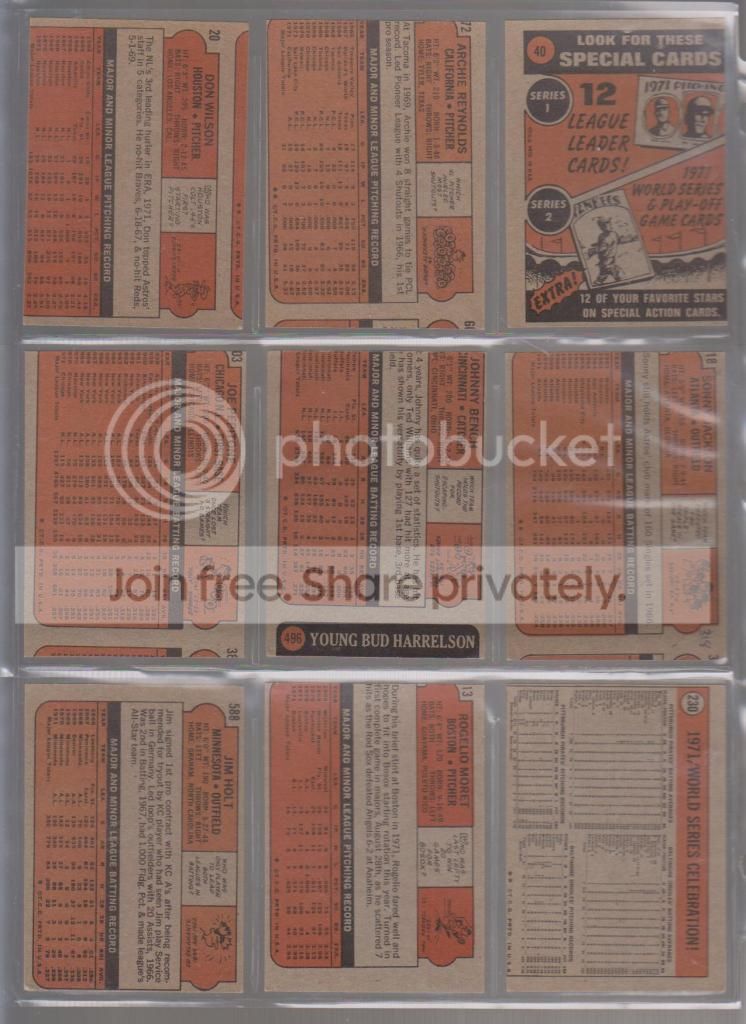
Photobucket
...since the back reveals it is attached to the boyhood photo of Bud Harrelson.  No way that card is ever leaving my collection.

Wow, and now some 1970 and 1971 Topps.  The early 70's were pretty terrible for quality control.
Photobucket
Nothing extreme in these cards, just some generally off center cards, all about the same amount.  I guess you can deduce that every once in a while, the sheets missed the cutter by about half an inch.
Photobucket
Wow, those 1970 cards sure look 100x brighter next to those 1971 backs.

Here is another favorite.  That 1968 Bernie Allen might be the worst diamond cut card I have ever seen.  Right behind it is that 1968 Steve Blass.  That Ken Berry is miscut and woefully out of register.  I have seen a bunch of 1968 Topps cards that are out of register (blurry to the layman).  I wonder if that was because of the burlap design. 
Photobucket
I have two of those 1967 Jack Baldschun cards, they are identically off center.  If anyone wants one, drop me a line, I will gladly send it to anyone who is as obsessed with miscut cards as I am...
Photobucket
Those diamond cut 68's are making me seasick.

I told you I have a lot of 1973 miscuts, here are some more.  Wait, that 1965 checklist looks fine...
Photobucket
...until you see the back...
Photobucket
...I like how some kid used it anyway.  I have seen a lot of 1962 Topps really off center, but not quite miscut.  That Wes Covington barely qualified, but the Mike Higgins shows that the wood border didn't go to the edges of the sheet.  I guess you gotta save on ink somehow.

Yup, I have some vintage Topps football miscuts too...
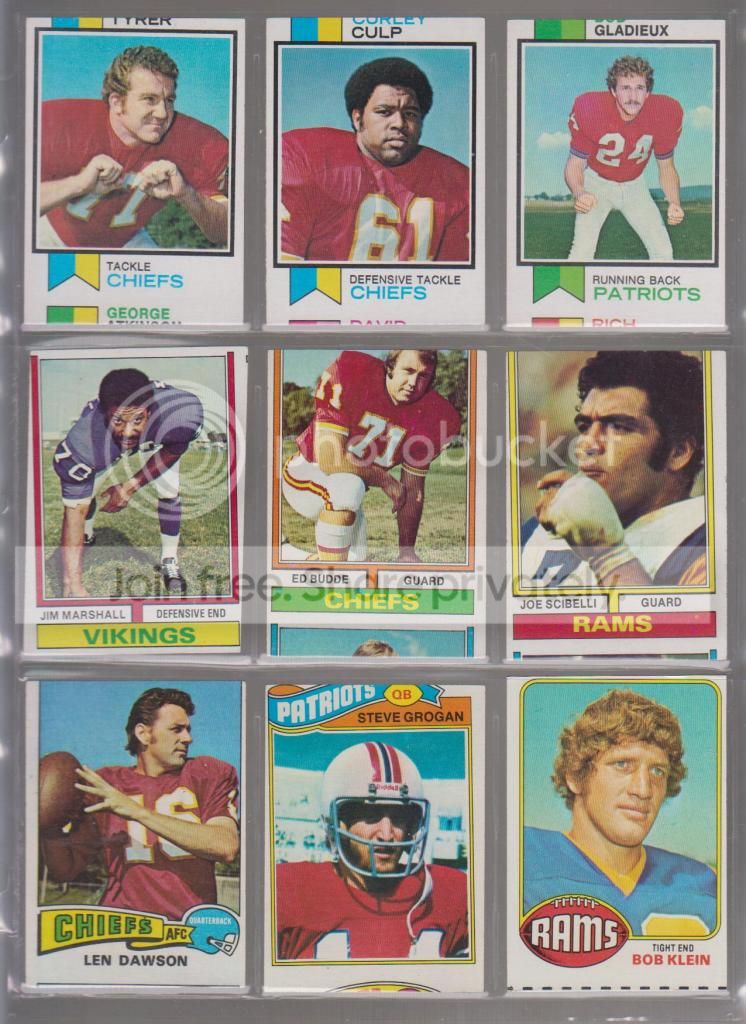
Photobucket
...tough being a Chiefs fan, huh?  That diamond cut Jim Marshall is oddly fitting, given his infamous claim to fame

Backs:
Photobucket
Here are some more modern football misprints and miscuts.  That quarter of a Giant was one of the cards as listed when I opened a pack of Pro Set back in the day.  I found that quite amusing and it has been amongst my error and miscut cards ever since. 
Photobucket
I have two of those Barry Sanders cards, once again, identical in off centered-ness, if anyone wants one.  As you can see, those two 1992 Topps cards aren't miscut...
Photobucket
They have blank backs.  And you may wonder why I have a completely blank card on this page.  Who cares about blank cards?  They use them as spacers all the time.  Well, that blank card came out of the same pack of 1992 Topps football cards as those blank back cards.  It is a completely blank card, not a spacer.  In my world, there is a difference.  I am not sure how that first series Star Wars miscut got in my collection (probably from my childhood), though I do have a bunch of diamond cut series four Star Wars cards.

OK, since I am just rambling here and showing everything in the damn binder, here are some more misprints:
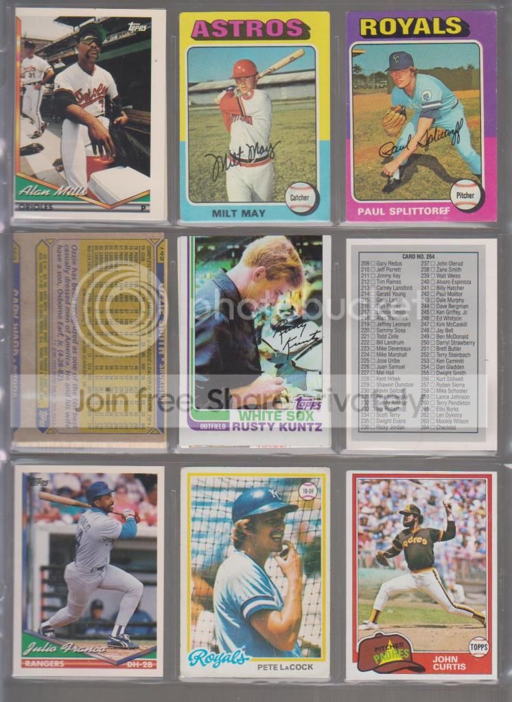
Photobucket
Some more blank backs (the Franco, LaCock, Mills, and Curtis).  A few miscut backs only from 1975 and 1987.  The Rusty Kuntz does not have a 1979 Carew back, it is just a doubled up card.  The 1990 Leaf checklist with the inverted Sid Fernandez back is pretty cool, and if I had needed that checklist back in the day, it would have been pretty damn frustrating.

The backs...
Photobucket
...show the blank backs and a diamond cut Pudge that got thrown in there for some reason.  I should probably put that closer to the front where it belongs.

Since I have no finish, I'll try and bring it all the way back to the beginning with a few more cut cards I found but did not cut myself...
Photobucket
...those last three cards have all been trimmed to some extent or another.  The 1956 Smokey Burgess had its entire border excised so it would fit in a 9 pocket page I assume...where as the 1962 Gene Woodling was cut smaller for some odd reason I cannot quite figure out.  That last card is a 1955 Topps Double Header.  Well, it had its head cut off, so it is a single header, and really, since it has no head at all, I guess it is a no header.