Showing posts with label miscut cards. Show all posts

Wednesday, February 7, 2018

Sorting things out.

       A few leftover notions from my 2018 Topps post from Sunday.

I spoke of the look of the new flagship set and while I don't hate it as much as I have 2017 or 2016 since Topps has gone to a borderless design, they have started to take on the vibe of late era Donruss base cards and this is not necessarily a good thing.  I think one thing that always made Topps special is that they had a specific feel and natural progression and the border is one of those things that now seems is lost. I feel this year's design, unlike the last 2 years, would look great with a border.  My awesome, utterly professional and in no way amateurish photoshop skills came up with this:


You can add a border and they look much more like classic Topps cards (think 1996 perhaps) and if you need to have things extend out a bit, you can see I took the ribbon to the edge of the card and continued the disintegrating name plate into the border as well as the team logo (where applicable).  I am sure somehow Topps thinks borderless cards are all "futuristic" but they have been around since 1990-91 and used on regular base cards since 1994 Donruss and Upper Deck.  I am not sure those are touchstones to be aspiring to. Flagship Topps always had a classic look and they seem to love to celebrate their history, so why have they turned their back on it the last few years in the name of "the future?"

***

We all recognize what this is:


I have collated cards for as long as I can remember yet I have never given it much thought.  I don't know if it is like scoring a baseball game but I suspect a lot of people have quirks to the way they do it, as I have seen folks in card shops and at shows do it their own way.  If I have a few dozen cards, I just do it in my hand like shuffling a poker deck.  If I have a few hundred, I sort them as you see above, into blocks of numbers of 50, e.g. 1-49, 50-99, 100-149 etc.  Then I sort them further.  If there is a few thousand to do, I so the same thing, then break them down into the 10s as I do it and then hand sort.  It is a monotonous activity but I have always found something relaxing and a little zen about it.  When I was a kid, my mom referred to it as me "playing solitaire" (which I supposed when you are 10 has a whole different meaning than when you are 15, but I digress).  And this is just numerically.  Anyway, does anyone have any different way they do things?  Let me know since I am momentarily obsessed with whether there's a whole different system I have never been privy to.  Not to mention there is also the classic 8x4 grid of sorting things by team, another issue all together.  I always do the teams alphabetically but maybe you do them by league and/or division?  I must know!  

***

And finally, a wonderful bit of card serendipity that I am sure we've all had or hoped to have at one time or another.  As I was searching for the new Topps on Friday, I was also meeting a friend for coffee at a Dunkin Donuts I don't normally go to.  I was a little early and there was a comic book shop next door, so I ducked inside there to kill the 10 minutes I had to wait.  Now, I am not comics guy but I can always enjoy a comic book shop just for the nerdy vibe, the toys, and there's always a chance they have some sports stuff stuck in among their wares.  They had a few long 5000 count boxes full of MTG and Pokemon cards and the like but then my eye caught the unmistakable dull gray cardboard color that can only be vintage Topps cards.  There was only a couple hundred of them, but what a vein of joy it was.  They weren't in sleeves or priced but going through them, there were some I just had to have...


How often does a coffee date turn into 1975 Topps?  More than that, was some of these...


I love the 1973-74 hockey design and there are a couple of wonderfully miscut ones as well.  So I only had a few minutes with these cards and I had no time to go through them all.  These are the few I nabbed while I was there initially.  When I went to check out, the n̶e̶r̶d̶ dude behind the counter said, "oh, anything in there without a sleeve is 10 cents"  I had lucked into a 10 cent vintage box in the middle of Wayne NJ on a Friday afternoon!  I had my coffee and caught up with my friend, and then you better believe I marched back into that shop and bought just about every one of those cards that even remotely interested me.


All because of my efficiency in finding the new Topps and over-promptness in meeting my friend, I now have a few hours of bliss ahead of me this week.  Oh, and I also have this:


If you need an explanation, I don't think we can be friends.

Tuesday, March 10, 2015

Mail Call: Wes is More.

Yesterday, I declared this month the one I settle all draft folder business.  This week, specifically, I am clearing out the forgotten trade post drafts that got lost along the way. 

The first one of these I did was over two years old (shame on me!), luckily, this one is only a year old.  Wes of Jaybarkerfan's Junk is one of the most generous and prolific traders I have come across during my blogging.  He straight trades, he holds contest after contest, he organizes card drafts that have quality stuff, and sometimes, he just plain gives shit away.  Back in the winter of 2014, he declared that if you sent him a SASE and a team, he would send you as many cards as he could stuff into it.  Pretty sweet deal and of course I couldn't resist because free stuff.
 photo mc1_zps8d884e07.jpg
He included a very shiny and see-thru Todd Hundley - one I didn't have - and a recent Gary Carter insert that I had yet to procure (and one that I have received a couple times since, but Wes was first).  There is some junk wax (Mookie is never junk, though) and some Mets cards from one of my all time favorite sets, the 1981 Topps.  All this for nothing more than .69 worth of stamps. 
 photo mc2_zpse5be1df9.jpg
I really wish I could remember why I scanned the back of that Elliott Maddox card.  I haven't a clue, to be honest.  I do see he played for the Senators back in 1971, which to a six year old in 1981 would have seemed like some kind of dark age, but I digress.  I also see that Wes stuffed that envelope so full, the post office machines tried to eat it.  Damn you USPS but thank you, Wes.  It's nice that this post came up today since yesterday I mailed out the scratch off from 2015 Topps I pulled to Wes because he asked for it.  Enjoy!

***

Since this was designated a Mail Call, there is stuff from Listia as well.  I recall picking up these Mariano Rivera cards to finish off his page (or maybe to start a second?).  Mo is now long gone now;  these old posts are gonna make me sad.
 photo mc3_zpsef26c0a0.jpg
The other cards in this scan were an odd Mets lot, one with a Ron Swoboda card I had never seen before:
 photo mc4_zps02c793a5.jpg
Ron Swoboda would have been just another vague Mets outfielder, but he made the wise decision to make an amazing catch in the World Series.  Ask Sandy Amoros or Al Gionfriddo if this is a good idea or not.  Anyway, this oddball card commemorates the catch and I had to have it. 

Last but not least is a card that probably should have its own post, but it was included in this one and it is a shame but hey, I may as well cover it since it is here.  I do remember very vividly the odyssey of this card. 
 photo mc5_zps10dcdf5d.jpg
Yes, that is a brutally miscut 1994 Upper Deck card.  The front is half Frank Thomas and half Cliff Floyd and the back is all Alex Fernandez.  When I saw it on Listia, I immediately became obsessed with it.  I had to add it to my collection, both for the big error and the Big Hurt.  I watched it, I bid on it, I nursed the bids, and in the end, I won it.  Then began a two pronged issue.  One, right after I won the card I got an email from some other dude saying he wanted the card.  He really really wanted the card.  Would I relist it for twice as many credits?  I turned him down.  He offered me $10, then $20 for it.  I still said no.  He must has emailed me 50 times with different scenarios and reasons begging me for the card.  It got so bad, I eventually had to block him.  Then after all that, the card took weeks to show up.  The seller had an impeccable feedback rating, so I found this odd.  Turns out, though, he tried mailing it in a PWE in the screwdown you see in the scan.  Seriously.  Somehow, it found it's way to me in a mangled envelope in the (in)famous USPS 'oops' plastic bag.  Now that I think of it, that might be why I included it with this post since Wes' SASE got eaten by the hungry machines as well.  Let this be a lesson to you kids, pack your cards securely and wisely because those evil sorting machines show no mercy. 

Saturday, July 12, 2014

Crushing Dreams One Unsolicited Email At A Time.

       I don't understand the internet and yet I openly embrace the internet; it is a nice place to visit but I wouldn't want to live there.  This blog of mine has opened my eyes to many quirks in the world of the interwebs.  I have lots of wonderfully introspective and (IMHO) well-written posts that barely anyone has read.  I have a few hokey and sarcastic posts that have a large amount of hits.  And then there is the odd yet very revealing fact that the most read posts I have are the two that have the word "post" in the title.  And there is one post that gets a huge amount of hits on google - I even mentioned it in my last post - and I can't quite figure out why...that is my entry on miscut cards.  It gets a ton of traffic, even after almost two years, and on the google images tab, the term "miscut cards" gives you just about all of the scans from that post right on the first page. 

       Another quirk of this post is that it generates a lot of random emails from non-readers, all of them asking about the value of their miscut card (as though I am some sort of expert).  I am sure I could throw up a half dozen of these emails with a simple search through my email folders, but I will instead show you this quick exchange between me and a dude named Kyran from last week as it perfectly captures what I am trying to say to anyone who writes me one of these emails.

On Thu, June 29, 2014 at 4:47 PM, kyran r <xxxx@gmail.com> wrote:


I was checking out your cards and I have a 1976 Pete Rose miscut. Half him and half some other player. I have had it for 25 years and always wondered if it had value. Would you have an idea on its value?, its like new. Thanks

Okay, having worked at a baseball card shop and been to a thousand baseball card shows as both a vendor and a customer, I know what Kryan is looking for here.  He wants to hear that what he is holding is very rare and unusual.  He wants to hear that he is special and that he has hit the proverbial cardboard jackpot.  He wants me squeal with girlish glee and tell him wonderful amazing things about his card.  And, 99 times out of 100, hell 999 times out of 1,000, this does not happen.  Alas, this is not that one time.  While it sounds like he has a pretty neat card, it is not going to make him rich.  I had to let him down easy.  Sort of how Pete let Ray Fosse down easy.


On June 30, 2014 8:34 AM, "max meyer" <xxxx@gmail.com> wrote:

I always love when people ask what baseball cards are worth.  The first knee jerk answer is always "whatever someone will pay for them..."  The most important thing to remember is that baseball cards are not commodities as much as they are a medium of nostalgia.

Seriously, a 1976 Topps Pete Rose books for about $20-25 in near mint condition.  The modern trade of cards has rendered book value practically meaningless unless a card is professionally graded.  When a card has a quirk like a print error or a miscut, that becomes even trickier.  A professional grader will merely assess it as such and to a collector of such things, the card is pretty worthless.  To a casual Reds fan or a Pete Rose fan, the card might have amusement value but not much more.  A crazed lunatic who obsessively collects Reds or Pete Rose stuff might offer you a lot of money for it but the real trick would be finding that person.

In closing, you will not be putting the kids through college with a miscut card from the 1970's, but if you enjoy owning it, it is priceless.

Hope this helped.

max

This reply contains a lot of the rote responses I have for people when asking about the monetary value of baseball cards.   People somehow think they have intrinsic value rather than adscititious value.  However, use these words and people will stare at you like a dog that's been shown a card trick.  So I put it in terms people can understand, e.g., you won't be able to put the kids through college with a bunch of 1991 Donruss cards.  A little stark humor can go a long way. 

I must say, he took it well...


 kyran r  3:32 PM (1 hour ago) to me

Thanks for you're reply. So much for early retirement. Guess I'll just hold on to it for the memory. Traded a bunch off cards for it when I was young. Thought it was the coolest and I had never seen one before.  Thanks again, Kyran

Kyran put it better than I ever could when he said he "thought it was the coolest" - you can't put a price on cool.   That's the real point isn't it?  If you enjoy what you have, you cannot put a price on that happiness or satisfaction.  That goes for baseball cards or life.  Too bad he didn't send me a scan of the card, perhaps I could get more cheap hits from it. 

Thursday, July 10, 2014

Habits and Views.

       While I have been on my vacation dog sitting for my brother, I thought maybe a change of scenery would recharge my interest in blogging a little.  Instead I have been kind of unplugged from the world and just mostly chilling out with the dog.  If anything, it has recharged my love of cooking as they have an amazing kitchen that I have taken full advantage of.  But this is a baseball card blog, not a foodie blog, so let's see if there is some unfinished drafts I can share with you.  Before I left last week I received in the mail two packages from fellow bloggers and I scanned their contents, so we'll take a look at those. 

One is a most venerable partner, Robert from $30 a Week Habit.  I had sent him two small piles in the last month or so and to reciprocate, he actually emailed me on his way to a show saying he was going to pick some stuff up for me from my want lists.  As I have pointed out before, he is an amazingly polite individual.
 photo hab1_zps620e047c.jpg
The two cards that are most appreciated, as they are from that aforementioned want list, are the Bautista and the Posey as they finish off player pages that had been sitting at eight for a while.  That Posey is just the regular Walmart blue card but it looks so vibrant in the scan, it almost looks like a refractor, especially when compared to the D'Arnaud, which is also Walmart Blue.  Also here are some recent inserts with Wright and Harvey that I didn't have, plus a couple of prospects from this year's Bowman - which is wonderful since I have purchased exactly zero Bowman this year.  Saving the best for last is the Tom Seaver UD Masterpiece red frame parallel, which is just a glorious looking card.  Upper Deck did a lot wrong at the end, those sets were not one of them.

He also included some miscut 1971 Topps cards I had asked him to set aside for me. 
 photo hab2_zpsdd9d2573.jpg
I asked for two of them, he included six.  That definitely meets my approval. These will find their way to a spot of honor amongst my miscut collection.  Thanks Robert!

On the other end of the trade spectrum was a first time trade with Chris from View From the Skybox.  From a quick little post I did a little while ago, Chris commented and emailed me that he loves blue parallel cards and would love to trade if I had any extras.  I found some blue Walmart cards from the last few years and a couple of the shiny blue Opening Day parallels and sent them to him.  Chris got me back with a nice bunch of Mets:
 photo view_zps50b42d3d.jpg
I didn't have the shiny version of the Seaver or Wright Chasing History nor did I have the WBC Wright card, which seems unthinkable.  He also included a nifty liquorfractor I didn't have, I almost have a page of these for the Mets, I will have to update my want lists to finish this off.  Then he finished me off with some blue parallels.  This seems a little counter-intuitive, but hey, I'll take it, especially that Murphy from this year.  What a stupendous photo that is.

Chris included a nice little note with his stuff...and believe me, I know from how shipping costs have gotten out of hand.  As you can see, they arrived safely.
 photo view-n_zpsb35f1b22.jpg
Chris collects a wide variety of things and has a great Ginter Relic Exchange program on his blog, so this may be the first trade we've done but it definitely won't be the last.  Thanks Chris!

As for the rest of my weekend?  Why, I am gonna watch soccer of course, but probably not the kind you are thinking of...
 photo soccer_zps02c0eafc.jpg
Look at how happy she is with that thing?  We should all be that happy.  Woof!

Saturday, April 19, 2014

Post Post.

Rejected titles for this, um, post:

       Past Posting.

       Post Haste.

       Post Tense.

       Post Modern.

       The Post With The Most.

       If You Come To a Post In The Road, Take It.

Okay, that last one is a little bonkers, but still.  Anyway, one of the most viewed entries in this blog was my dissertation on miscut cards, which itself was an off-shoot of a posting by Night Owl about the dangers and misadventures of cutting vintage cards off of boxes.  My love of oddball food issues has been pretty well documented on this blog.  What is just inexcusable on my part is that until this week, I did not own complete pages of the classic 1960's Post cards; all I had was a single example of each year hiding in the back of my retired players binder.  I am not sure what came over me, but I decided to remedy that woeful situation and bought lots of each year from the same seller (saves shipping after all).  These are the pages that came from that eBay buying spree.

1961:
 photo post61_zpsd2b62da7.jpg
The Jim Coates was the original card I had, the other eight are what I selected from a very eclectic lot.  Names like Marvelous Marv and Vinger Bend come to mind when looking at these, not to mention that Moon Shots, while impressive, are the second thing one thinks of when looking at Wally Moon - especially when looking at him.  Coming off cereal boxes, the backs of these cards are boring. but someone tried to make this one at least a little cooler. If I was a kid with a blank back, those ruboff tattoos or stickers would definitely have found their way to the vast landscape of empty cardboard. 

1962:
 photo post62_zpsc6819d12.jpg
Post adds a little more color and a logo to the fronts of these but keeps the basic design the same.  In fact, given that they were using only one side of the card, this is really the most efficient design you could ask for.  You get a sturdy photo, a line of yearly and career stats, and a nice write up about the player.  You would be hard pressed to come up with a better one.  The Felipe Alou was the original card I had, the others chosen to fill out the page were either great names (Bubba! Blasengame!) or due to their sparsity in my collection.  I really should have more Don Zimmer and Bob Allison cards.

1963:
 photo post63_zps373e96b0.jpg
The design sticks to the basics of the last two, with a tip of the cap towards the 1961.  I have no idea if all these cards were owned and trimmed by the same kid or not but I must say, he did not get better with age.  Maybe he had the bad habit of eating his cereal while trying to cut the cards off the box.  The original card here was the Drysdale, which was altruistically donated by the aforementioned Night Owl after he posted about his Post cards. I must say, Post did like to get players posed with a bat on their shoulder.  I actually had to pick and choose to keep the whole page from being nothing but players with lumber on their deltoids.  1963 was a pretty good year to be a kid and a baseball card collector as you had the Post cards, the seminal Topps set, and the first Fleer set with modern players.  

Sadly, for some reason, Post stopped putting baseball cards on their cereal boxes and wouldn't make another set for 27 years.  We would have to eat Frosted Flakes and Twinkies in the 1970's and Drakes Cakes in the 1980's to fill the void.  I might have to start picking up some of those to make complete pages of them next.   If I am gonna be an oddball food issue collector, I better be willing to go all the way.

Saturday, April 28, 2012

Miscut.

    With all the talk about scissors and cutting your own cards, what happens when the professionals go wrong?  I think when we open a pack of cards, we all have the expectation of perfection or, at the very least, competency.  I think we have all run into a miscut card at one point or another.  Lucky for you, I collect these kinds of cards (so you don't have to).  As I have said many many times before, I love oddball cards, and not just the kind put out by Mr. Turkey or Kahn's Franks.  I also really love the one-of-a-kind gems that can only be created by a great lapse in quality control.

Here are some recent examples:
Photobucket
Pity, that was the first card I saw of Junior in a White Sox uniform.  I'm not sure if that 2007 Kotchman is miscut or just misprint, but if you look, you'll notice how terribly askew the foil is applied on that card.  I bought a whole box of those 2005 Playoff Prestige cards, imagine my joy and horror that for six straight packs, I got a wonderfully miscut card amongst my normal cards.  I especially like the color chart on the side of the Furcal in the upper right.  Let's look at the backs too...
Photobucket
The test pattern is also on the back.  You can see much better how terribly miscut those Playoff cards are, if you just saw the fronts, if you didn't know any better, you might think that askew look was part of the set.

There's more...oh boy is there more...
Photobucket
Once again, Rafael Furcal is prominently featured.  It is quite disappointing, at least to most people, to get a miscut card in a high end product like Gold Label.  Not for me.  I am pretty sure that card was the highlight of that box for me.  Those Bowman Chrome cards on top came in the same pack; considering there were only three cards per pack, that is quite the quality control issue.  Somehow some misprint cards wandered into my miscut pages.  OK, lets look at those real quick.  Those 2005 Bowman gold parallels might, at quick glance, seem fine.  Then, on second glance, you see Bartolo Colon's signature coming out of Shannon Stewart's head - a little creepy.  Also on there is a Hideki Irabu rookie and a Nefti Perez sans foil on the front.  You would think there would be more missing foil cards with the proliferation its use in the last decade or so, but I haven't seen as many in my day as I would imagine I should.

We might as well look at the backs of all these...
Photobucket
You can plainly see that it is Preston Wilson that is the conjoined twin of that Rafael Furcal.  Outstanding.

Some miscuts are more extreme than others...
Photobucket
That Shea Hillenbrand is barely miscut.  It is almost just really really off-center.  But, I determined it to be just miscut enough to join the pages.  Luckily, a few much better examples are prevalent on this page.  Those Gooden and Ripken cards have been part of this collection since I pulled them back in the 80's and they are wonderful.  That Dave Cochrane is also a favorite.  The "No Ink Additives Allowed!!!" is pure gold.  The odd warning and extra exclamation points make it almost surreal.  I pulled that card from a 1993 Ultra pack.  Also shown are some 1993 Ultra misprinted foil cards. 

On the back...
Photobucket
...you can see even more warnings on that Cochrane card (I wonder how many more there were on those Ultra cards?) and you can also see that it is Dave Schmidt that is the partner of that Dwight Gooden card.  Or is it Dwight Gooden who is the partner of the Dave Schmidt card?

We have a few more minor modern misprints and miscuts on this page.  My favorite is the early Upper Deck cards with extra and misplaced holograms.  Perhaps someone was trying to counterfeit those Paul Gibson and Torey Lovullo cards? Oh the humanity...
Photobucket
But wait?  What else is on this page?  Could it be miscut 1975 minis?  Indeed it is.  I have seen many of these over the years, I guess quality control was not high on the list of priorities for a test issue, and I kept a few for my collection.  The Al Oliver is cut almost so you can see how the set would have looked had the team name been on the bottom rather than the top. 

The backs...
Photobucket
...show more of the same.  That Higginson card is a separate card from the Sandberg card.  The Sandberg back is normal and the Higginson front is normal, so I display them back to back.  Same with the misprinted and miscut Zane Smith up there, it is a matching pair with the Dunston on the front.

Let's dive into some vintage miscuts...
Photobucket
...the 1975 Topps are probably my favorite for miscuts.  All the colors make for some very interesting pieces of modern card art.  Here you have a fine mishmash of horizontal and vertical; some extreme and some subtle. 

The backs of these...
Photobucket
...aren't quite as interesting as the fronts, to say the least.

Here are some more old school Topps miscuts:
Photobucket
That 1979 Garvey is a double print.  I wonder if the card next to it is also Garvey...alas, it is not quite over far enough to see.  I love the little stars on the borders of the miscut Grimsley Traded card there.  You see these on full sheets and I guess they were part of either the guide for the cutting machine or perhaps part of the printing process.  Alas, I don't know enough about the industry to know for sure.  I wonder why they never put rows of stars on the actual cards, they look kinda boss...

Backs...
Photobucket
...meh. Moving on.

You want 1973's?  We got 1973's.  I am not sure where I got so many miscut 1973 Topps cards, but I have a ton of them.  I have seen a ton of them.  I know 1973 was the first year they did a majority of the set in one series, I wonder if one has anything to do with the other?
Photobucket
Quick aside:  I once convinced a bunch of kids that Johnny Jeter was Derek Jeter's dad.  This was 1997 or 1998, before the internet was ubiquitous and could diffuse such a ruse.  I imagine there was a rush on his cards at local card shops for a week or so before the truth was revealed.  I don't know if I like messing with kids or Yankees fans more.

Backs...
Photobucket
...the backs show that the dotted lines are the edges of the sheet.  I prefer the stars.

1972 was not much better that 1973.  I have seen all form of miscut and misprinted 1972 cards. 
Photobucket
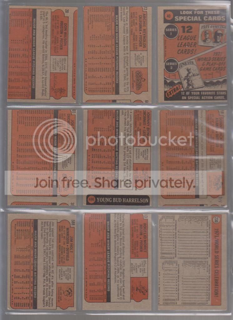
Hmmmm...wait, I think it is dotted lines on the bottom, stars on the sides.  Perhaps that is how the printer knew which end of the sheet was up?  I just noticed that for the first time...it all makes sense now. I am both supremely observant and an idiot.  A Cincinnati Reds fan once offered me $20 for that Bench miscut.  How do you price something that is unique, especially...
Photobucket
...since the back reveals it is attached to the boyhood photo of Bud Harrelson.  No way that card is ever leaving my collection.

Wow, and now some 1970 and 1971 Topps.  The early 70's were pretty terrible for quality control.
Photobucket
Nothing extreme in these cards, just some generally off center cards, all about the same amount.  I guess you can deduce that every once in a while, the sheets missed the cutter by about half an inch.
Photobucket
Wow, those 1970 cards sure look 100x brighter next to those 1971 backs.

Here is another favorite.  That 1968 Bernie Allen might be the worst diamond cut card I have ever seen.  Right behind it is that 1968 Steve Blass.  That Ken Berry is miscut and woefully out of register.  I have seen a bunch of 1968 Topps cards that are out of register (blurry to the layman).  I wonder if that was because of the burlap design. 
Photobucket
I have two of those 1967 Jack Baldschun cards, they are identically off center.  If anyone wants one, drop me a line, I will gladly send it to anyone who is as obsessed with miscut cards as I am...
Photobucket
Those diamond cut 68's are making me seasick.

I told you I have a lot of 1973 miscuts, here are some more.  Wait, that 1965 checklist looks fine...
Photobucket
...until you see the back...
Photobucket
...I like how some kid used it anyway.  I have seen a lot of 1962 Topps really off center, but not quite miscut.  That Wes Covington barely qualified, but the Mike Higgins shows that the wood border didn't go to the edges of the sheet.  I guess you gotta save on ink somehow.

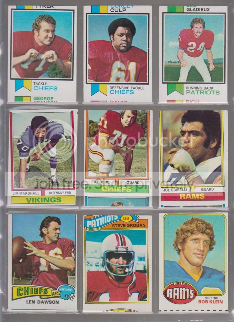
Yup, I have some vintage Topps football miscuts too...
Photobucket
...tough being a Chiefs fan, huh?  That diamond cut Jim Marshall is oddly fitting, given his infamous claim to fame

Backs:
Photobucket
Here are some more modern football misprints and miscuts.  That quarter of a Giant was one of the cards as listed when I opened a pack of Pro Set back in the day.  I found that quite amusing and it has been amongst my error and miscut cards ever since. 
Photobucket
I have two of those Barry Sanders cards, once again, identical in off centered-ness, if anyone wants one.  As you can see, those two 1992 Topps cards aren't miscut...
Photobucket
They have blank backs.  And you may wonder why I have a completely blank card on this page.  Who cares about blank cards?  They use them as spacers all the time.  Well, that blank card came out of the same pack of 1992 Topps football cards as those blank back cards.  It is a completely blank card, not a spacer.  In my world, there is a difference.  I am not sure how that first series Star Wars miscut got in my collection (probably from my childhood), though I do have a bunch of diamond cut series four Star Wars cards.

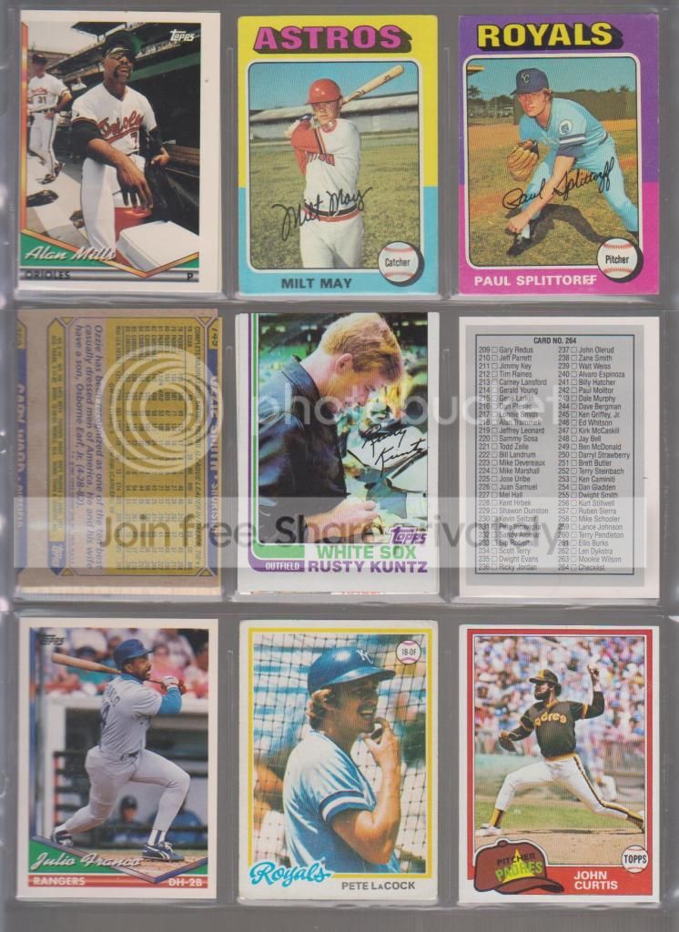
OK, since I am just rambling here and showing everything in the damn binder, here are some more misprints:
Photobucket
Some more blank backs (the Franco, LaCock, Mills, and Curtis).  A few miscut backs only from 1975 and 1987.  The Rusty Kuntz does not have a 1979 Carew back, it is just a doubled up card.  The 1990 Leaf checklist with the inverted Sid Fernandez back is pretty cool, and if I had needed that checklist back in the day, it would have been pretty damn frustrating.

The backs...
Photobucket
...show the blank backs and a diamond cut Pudge that got thrown in there for some reason.  I should probably put that closer to the front where it belongs.

Since I have no finish, I'll try and bring it all the way back to the beginning with a few more cut cards I found but did not cut myself...
Photobucket
...those last three cards have all been trimmed to some extent or another.  The 1956 Smokey Burgess had its entire border excised so it would fit in a 9 pocket page I assume...where as the 1962 Gene Woodling was cut smaller for some odd reason I cannot quite figure out.  That last card is a 1955 Topps Double Header.  Well, it had its head cut off, so it is a single header, and really, since it has no head at all, I guess it is a no header.