Repository navigation
Off-canvas Navigation/Menu (Mobile) in Pure CSS using Tachyons? #10
Description
Can we build an "off-canvas" in pure CSS (without) an JS...?
Links/examples/code please if you have come across it! 👍
Edit:
Thanks to @Cleop for implementing this for the @dwyl site. #10 (comment)
We have split the code and simplified it so that anyone can learn from it!
Activity
adds top nav to MVP UI with "fake door" ("burger") menu button/icon t…
iteles commentedon May 29, 2017
This is a pure CSS one that looks good, but I needs to be 'converted' to tachyons if we use it (looks mostly achievable without custom tachyons classes): https://isabelcastillo.com/pure-css-mobile-toggle-menu
Cleop commentedon Jun 14, 2017
This is what has been implemented on the dwyl-site redesign: https://github.com/dwyl/dwyl-site/pull/264/files#diff-b0638442d6af953ff33fca3d49113579L18
It is based on a similar approach to the link shared by @iteles. In summary you use a checkbox as your burger menu which alternates between hiding and revealing the menu when it is checked or unchecked (ie. when a user clicks on the burger to open/close the menu). The checkbox is hidden by using a
<label>which is essentially a custom checkbox and in our case we use the burger bars as what we display to the user (to them it looks like a regular button not a toggling checkbox).In order to display the menu, another class is required which uses the magic of the tilde
~to alter the display of the menu elements by increasing their height so the hidden content can then be seen. The tilde looks for the sibling of the checkbox which contains the class.menuand changes on the active state of:checked(see the css excerpt below or checkout: https://stackoverflow.com/questions/10782054/what-does-the-tilde-squiggle-twiddle-css-selector-mean to learn more about how tildes work.)Which looks like:


It was achieved using:
absolute top-1 right-1dn-ns(display none on screens that are not small ie. don't show the burger menu unless you're using a mobile screen)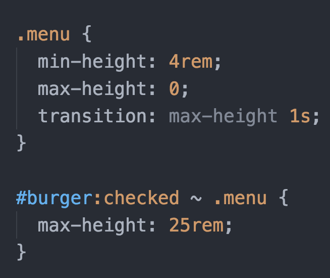
As tachyons doesn't have min/max height values or this kind of transition specifically.johnyluyte commentedon Dec 14, 2017
Not pure CSS, but for anyone looking for a javascript way, here is an example: https://coralproject.net/
Right click to view its source and search for
openNav.It uses simple javascript to manipulate DOM class, and uses SVG for the burger button. Quite clean and straightforward.
create nav-menu.html for #10
borrow nav code from dwyl-site #10 (comment)
responsive nav menu *almost* working. not quite pixel perfect ... #10
removed duplicate/unnecessary css classes and re-work layout #10
add explanatory in-line code comments to nav-menu.html file for #10
add explanation of responsive nav menu #10 to README.md
Merge pull request #52 from dwyl/responsive-nav-menu-issue#10
nelsonic commentedon Feb 4, 2020
GOTO: https://github.com/dwyl/learn-tachyons#responsive-navigation-menu