Showing posts with label Milton Caniff. Show all posts

Wednesday, April 17, 2013

George Wunder Terry Sundays 1947--2

Nine Days' Wunder

I have no idea whether anyone is interested in these things, but as long as I have them I'll post a few more before giving it up as a waste of time. Here are nine more Terry Sundays from George Wunder's first year on the strip. In these 1947 halves Wunder begins his second storyline. The femme fatale from the previous story, Ermine Toy(!), returns in the company of Theodore Bor, an amazing fat man of the sort only Wunder could have designed. Chopstick Joe continues his supporting role and Terry's old pal Pat Ryan makes a final appearance. Again--regrettably--some strips are missing.

[UPDATE: I didn't get my facts straight. This is not Pat Ryan's final appearance. He continues into the next story, the one introducing Spray O'Hara.]

Ermine Toy represents something that irked me about Wunder's early stories. Under Milton Caniff Terry's romances had always been a big part of the strip. Wunder continued that tradition. The difference is that we could understand Terry falling in love with Caniff's women. (With the possible exception of Burma, who was plagued by the temporal paradox of having met Terry when he was a schoolboy.) Instead Wunder hooked the guy up with a string of wackos that leaves us wondering what the hell Terry saw in them. Murderous, bitchy, vain, manipulative...the prize of the lot was Baroness Popoffnikoff, who was so self-centered that she secretly dumped a cargo of desperately-needed relief supplies to make room for her fancy wardrobe. All these women had to do was approach within twenty feet of Terry, and he would instantly jettison all common sense and fall madly in love.

After awhile Wunder switched the romances to secondary characters, like Hotshot Charlie and his future wife, Spray O'Hara. This was a wise move, as it saved Terry from seeming a complete idiot. These other women were however cut from cloth similar to that of Terry's ex-paramours.

Visually Ermine is a knockout. As Wunder's angular style of character design evolved, women's faces suffered the most. Ermine combines Wunder and a bit of Caniff with excellent results. In my opinion Ermine was Wunder's hottest hottie.

I also need to mention Chopstick Joe. Wunder's work always contained a streak of humorous exaggeration, and Chopstick Joe was right up his alley. Though Caniff created Joe, it was Wunder who brought him to life. Design, posing, even his dialogue, make Chopstick Joe one of my favorite Wunder characters.

16 March 1947
23 March 1947
6 April 1947
13 April 1947
27 April 1947
11 May 1947
18 May 1947
25 May 1947
8 Jun 1947
Next time: respite from Wunder puns.

Friday, April 12, 2013

George Wunder Terry Sundays 1947--1

The Wunder of it All
I read that Hermes Press is reprinting the first two years of George Wunder's Terry and the Pirates. It's a welcome project, though a 9x12-inch book isn't likely to full justice to Wunder's artwork, Especially the Sundays. I feel a shiver whenever I read that Sundays will be "thoroughly restored."

In a recent post Ger Apeldoorn offered black-and-white samples of early George Wunder Terrys. As it happens, a couple of the Sundays which open Ger's post are the ones missing from my stack of 1947 tear sheets. Wunder took over Terry and the Pirates on 30 December 1946. As Ger notes, when he started drawing the strip Wunder followed Caniff's lead for a while before developing his personal style. However this was true mostly with character faces: Wunder's highly-detailed, heavily-inked approach to drapery and settings changed the strip's look immediately. Ger's posting prompted me to dig out my box of old Sundays and scan the few examples I have of Wunder's first Terry continuity.

In this story Wunder polishes off two major Caniff characters. Wunder only used six members of Caniff's vast cast. Three enjoyed long runs. Hotshot Charlie continued as Terry's comic sidekick for several more years. Eventually he married Spray O'Hara and left the strip. Chopstick Joe, a shady Chinese entrepreneur, was the boys' sometime employer in the years preceding Terry's return to the Air Force. The unforgettable Dragon Lady continued to pop in and out during the life of the strip, looking different every time. The other three holdovers were Terry's big-brother surrogate Pat Ryan, arch-villain Tony Sandhurst and the voiceless giant Big Stoop. Pat returns briefly in Wunder's second continuity, then fades forever. Sandhurst and Big Stoop make their final appearances in this episode.

As a young fan I used to wonder why Wunder didn't use more of Caniff's famous characters. Over the years I realized Wunder probably knew he'd never satisfy anyone with his take on the likes of Burma, Normandie, Flip Corkin, and the other wartime friends and foes Caniff had made famous. I'll wager he decided to make a clean break and create his own group of players who could rise or fall on their own merits. Except for the Dragon Lady; he'd have been a fool to dump her. At any rate, Wunder's story philosophy was different from Caniff's. Instead of complex, intertwining storylines with characters disappearing and reappearing, Wunder told self-contained stories. He almost never brought a character back.

The following Sundays were published in February and March of 1947. Sorry about the missing dates; check Ger's site to view some of them.

2 Feb 1947
16 Feb 1947
23 Feb 1947
2 Mar 1947
9 Mar 1947

Friday, March 29, 2013

Ray Bailey assists Caniff

Bailey Rocks!
Anyone who's followed this blog knows I admire the work of Ray Bailey, a Caniff-school artist who worked both in comic books and newspaper strips.

Bailey started developing his personal style on a contemporary Western strip, Vesta West, in 1942. In 1945 he launched an aviation-themed adventure strip, Bruce Gentry. In 1951 he drew Tom Corbett, Space Cadet for a couple of years. After that he went into comic books. He did some of his best work for Dell, including TV tie-in's, movie adaptations, and several issues of Steve Canyon. After Dell spun off from Western Printing to become a separate company, Bailey continued with Western's  Gold Key line doing stories in weird titles like Boris Karloff. His last comic work seems to have been for Tower (Undersea Agent) circa 1967.

Biographies always say Bailey assisted Milton Caniff on Terry and the Pirates. I've wondered just what he did and when. Bailey's personal style looked so much like Caniff's that spotting his assistant work is a tough job. But while leafing through a pile of 1945 Terry Sundays, I found what I believe are Bailey backgrounds.

It's all in the Rocks. Nobody inked rocks exactly like Bailey, and he put them in every strip he drew. Bailey rocks were based on Caniff's rocks from his Sickles stage, the mid- to late-1930s. But Caniff rocks were Caniff rocks and Bailey rocks were Bailey's.

This rockin'-out Sunday is dated 3 June 1945.


Monday, March 25, 2013

Caniff at Work Video

The Man at Work
I strongly recommend you visit Mike Lynch's always-worthwhile blog for the link to an intriguing video from the early 1950s showing Milton Caniff in his studio. The material was retrieved by one Jeff Quitney from the Prelinger Archives, a treasure trove of rare films.

Obviously this is raw footage for a short subject about Caniff. It's no documentary. Caniff's 1940s Terry work is mushed together with then-current Steve Canyon drawings. The story is told in the cornball style of humor segments from old newsreels. Caniff calls upon his acting chops for hammy scenes at the drawing board and a truly weird sequence in which he imagines he sees the real-life Flip Corkin reflected in a table top. Most of the drawing Caniff does is inking pinups of  Steve Canyon babes (though at one point he's shown adding extra strokes to an already-finished daily). One corny but amusing bit has Caniff measuring a woman's décolleté with a ruler marked to show acceptable amounts of plunge.

At one point the camera pans Caniff's reference sketches of Chinese subjects. Stylistically they look like they came from the Terry years. They're far and away the best art in the film.

If you're a Caniff fan, don't miss this fascinating video.

Monday, December 26, 2011

Noel Sickles and Milton Caniff--2


The Great Postum Face-Off

In my last post I presented a Noel Sickles Postum ad. I mentioned having once seen an alternate version. I am grateful to Fortunato Latella for turning up a copy of that version. (In case you don't know, Fortunato curates an excellent comics blog which is always worth reading.)

Fortunato's ad is in third-page format, while mine is a half page. I had misremembered that the art in each version was completely different. In fact some panels were the same. The two make an interesting comparison.
Panel 1 of the third page is a completely different drawing from panel 1 of the half. Note that in the third page the girl sits on the passenger's side of her car. In the half page the car points the other way and she sits (more logically) behind the wheel. The dialogue in the third page panel is shorter, which is a good thing because the panel is only half as wide.The second panel of the third page telescopes into a single frame what takes the half page three panels to tell. The half boasts a lot more great artwork, but the third-page version takes the prize for economical storytelling.The next panels are the same in both formats. However the third page's panels have more art. We see more of Mr Coffee Nerves' vest and the hero's coat in the first panel. There also seems to be more "air" at the top. The next panel shows more of the house in the third than in the half, and we see all of Mr. CN's left arm, which is cropped in the half page.

The dialogue has been tweaked between versions. Some changes are so small I wonder why they bothered: "What does he advise" in the third is "What did he advise" in the half, while "If you give up flying" becomes "If you give up trying." The hero's dialogue is considerably simpler in the third page. Mr. CN's lines are the same in both versions.
The last two story panels are the same in both formats. Again they show more art in the third than in the half. In the award scene we see an extra aviator on the left side and an extra spectator on the right. The officer's dialogue differs slightly between versions. The girl's dialogue is the same, but her balloon is lettered anew in each version to fit the different panel sizes. The hero's final balloon has also been relettered between versions. In the half page the hero's picture is larger relative to the copy, pushing the final paragraph into a narrower column.

When I first saw this ad I assumed that the half-page version was the original. But comparing the versions I believe the third-page came first. I'm pretty sure panels from the third were cropped to fit the half-page layout. It makes more sense than extending the edges of smaller panels for the third.

Why would the agency draw three new panels and add extra dialogue to convert a third page to a half? Why not? It occurred to me that my assumption that the half-page was the "real" one was based on the syndicate procedure of using expendable panels to convert half page Sundays into thirds. But when this ad was produced in 1940, that process wasn't yet standard procedure. Probably after the agency finished the third page the client asked for a half-page version. The agency reformatted existing panels and added extra art and text to fill the space.

Wednesday, December 14, 2011

Noel Sickles and Milton Caniff

A Postum Posting
This is the only tearsheet I own from the "Paul Arthur" Mr. Coffee Nerves adventures. A fine one it is! Caniff has said that "Bud" Sickles handled all the art on the CN strips except Mr. Nerves himself. That is borne out by this half-page, which features a sort of Scorchy Smith gone to the Dark Side. What love and enthusiasm Sickles put into drawing those planes and cars!Reading these old ads one wonders if 1930s women were really as materialistic as all that. Don't bother calling me until you get those wings, loser! (Nitpicker's afterthought: doesn't it look as if the balloon in panel 8 was re-lettered? A Comics Code change?)

Interestingly, in a library magazine archive I discovered a versiion of this strip (printed in black and white) with the same script but entirely different art. Still by Sickles, but a complete re-draw. Unfortunately I didn't have a portable scanner in those days. If anyone has the alternate version I'd love to see it again. Were there other similar variants?

Friday, November 20, 2009

Technique Talk--2

Mouthing Off
When posting a story from the Golden Age Speed Comics, I was fascinated by the anonymous artist's shorthand "surprised mouth," which he used several times in the story. It looked like this:
The mouth is a black oval with a similar, smaller shape cut out of the bottom. Depending on how you look at it, the smaller shape represents either the tongue (I believe this was the original intent) or the lower teeth (in which case the guy is missing a few). This led me to ruminate about the stylization of mouths in "realistic" (i.e. non-cartoony) comic art.

Like cartoony art, realistic comic art is mostly shorthand and caricature. The main difference is that realistic art seeks efficient ways to suggest how things really look (more or less).

Realistic comic artists have developed more abstractions for the mouth than for any other facial feature. It's no wonder. The mouth is a very complicated structure. The expression muscles push and pull it all over the place. Talking changes its shape radically. What's more, the construction of the lips and the corners of the mouth are far more complex than they seem. Comic artists, pushed by personal style, deadlines, and skill limitations, develop their favorite way to say "mouth" with a minimum of hassle.

For some reason, on a male character a "full mouth"--that is, a mouth with both upper and lower lips completely drawn--appears effeminate:Drawing the lips too round or too full can detract from the "man's man" look realistic artists usually strive for. Impressionists Noel Sickles and Milton Caniff circumvented this potential pitfall by drawing a thin upper lip in shadow, reduced almost to a line, while indicating the lower lip only by the shadow it casts on the chin:
This soon developed into a formula that served realistic cartoonists for decades: two parallel lines, a long thin one on top and a short thick one below.Frank Robbins took this to an extreme. Toward the end of his newspaper career, his characters wore two lines of equal length and thickness, often spreading across the entire face.Profile mouths followed a similar evolution. Again a fully-drawn mouth is complicated and liable not to look sufficiently masculine:
Once more cartoonists eliminated the outline of the lower lip and reduced the upper lip to a line with a hint of thickness.
Once this approach was streamlined, this became another formula used by countless strip and comic book artists.
Note how the overhang of the upper lip was beginning to disappear. Frank Robbins took the abstraction one step further by getting rid of the lip profile altogether. The mouth became two short dashes floating in space:
An alternate approach was to draw the profile of the jaw as an unbroken contour with the mouth lines superimposed:
Yet another variation (frequenty used by George Wunder and the later Caniff) was to combine the lip overhang and the lower lip into a single unit. Unlike in the previous example the lower lip was differentiated from the chin:As time went by and the "manly school" moved from newspapers to superhero comics, the more realistic approach taken by contemporary magazine illustrators influenced some cartoonists. However few challenged the thin-upper-lip-no-lower-lip formula. Carmine Infantino's illustration-inspired mouth dared to show the outline of the upper lip. However the lower lip remained an indication:
Infantino was pretty much alone in this respect until the revolution headed by Neal Adams brought photographic realism to comic books. Wallace Wood was the only other notable upper-lip man. He developed an odd "half-upper-lip" which featured the septum but not the rest of the lip. This indication became a cliche with Wood, and was dutifully duplicated by his many imitators.
Wood also increased the size of the lower lip shadow, often modeling its edges to further sculpt the lip. It was an "illustrator-y" version of the Caniff mouth. It's also worth noting the unique mouth Jack Kirby developed in the 1960s: he drew the top shape of the upper lip, resulting in this:
Having mentioned Kirby, I must nominate him as the perfector of the open superhero mouth. Two thousand artists have drawn variations of this mouth ten thousand times. It fairly bursts with drama and action, yet bears no relationship whatever to a real mouth. The perfect shorthand!There don't seem to be as many open mouth stylizations as there are for closed mouths. I suppose it's because in superhero comics most open mouths are shouting, and the Kirby mouth fills the bill. John Romita did develop an unusual schtick, however, which I don't think anyone else used. This was his gritted-teeth mouth:I conclude this ramble with the oddest open-mouth abstraction I know. It brings us back to the Golden Age, when superheroes still smiled a lot. I first saw the mouth on Jerry Robinson's Robin, but it enjoyed a certain popularity in the forties before going extinct.Note that the black semicircle representing the open mouth doesn't connect with the the upper lip. The upper teeth are created entirely out of negative space. It's a fascinating trick, but it had a flaw: colorists often didn't get the idea, and colored the teeth pink like the rest of the face. The result was a face with two mouths, one open and one closed.

Sunday, June 7, 2009

Technique Talk

Hail the Hallowed Halo
Many years ago Jim Vadeboncoeur and I interviewed the late John Buscema about his early career. At one point I asked him why he and other comic artists of the 50s and 60s put "halos" around characters rather than letting a black background touch them. Here's an example of what I mean, from a Golden Age Ruben Moreira story:
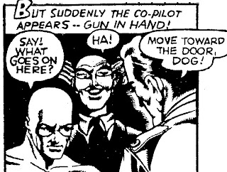
The halo preserves the outline of the co-pilot's face. In the printed comic the effect might be subdued by running a dark color over the halo so it becomes part of the background:
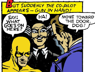
Too often comic book colorists chose a bright color, giving the character a radioactive glow:
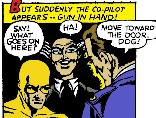
When you look at it closely, though, the halo wasn't necessary. Had Moreira left the guy's nose open instead of in shadow, the background could have met the face and the face would have read just fine.

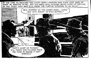
But comics artists often used halos when outlines didn't need preserving. Here's a particularly egregious example from Milton Caniff, who of all people should have known better. [Sidebar: I'm not convinced this is 100% Caniff; I suspect ghost work.] With the exception of Terry's left arm and Dude's shirt front, none of these edges needed saving. The halos here were apparently artistic, not practical, choices.
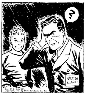
As for Buscema, he shrugged halos off as a stylistic trick comic artists adopted from illustrators they'd admired in school. This intrigued me, so I pulled out some tearsheets and went looking for halos.

I found quite a bit of evidence to support Buscema's theory. Many illustrators lightened the areas around characters, especially around their heads. Here are a couple of 1944 advertising examples.
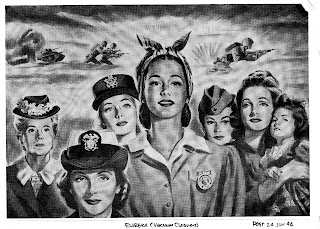
The group of women is from an ad for Eureka vacuum cleaners. Note how each head is haloed. I understand using a halo to highlight the main figure. But halos don't make sense on the secondary figures, like the elderly woman and the one with the cap to the main figure's right. In the full-size reproduction we see that the grey background tones are hatched in with a brush, just like Caniff's black background.

In another ad, one pushing Wilsonite sunglasses, W. Calvert also uses a halo to emphasize the main character. I confess I reproduce this ad not only to show its artwork, but also to share the wonderfully-awful wartime pun in the headline. Anyway, consider the halo around the aviator. It certainly draws attention to the his face, the most important part of the picture. Unfortunately it also eats away much of a background figure. This partial figure looks really weird. Calvert would have been wiser to move him further back and to the right--or to leave him out altogether. I speculate that this figure was indeed fully painted at first. Calvert might have sponged out the halo later to prevent the background interfering with the aviator's head.
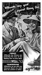
Which led me to wonder if some comic book halos weren't style at all, but the result of insufficient planning. Consider how a cartoonist can handle a large foreground black area. The classic choice is to position it against a white (or grey) part of the background. But what if the background is also black? There are two options. We can deliberately lose the foreground black into the background. George Tuska did that with Buck's hair in this Buck Rogers daily:
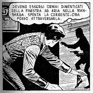
As long as you plan the black areas properly, the viewer will understand the drawing. As we'll see later, you can lose quite a bit of foreground black without your drawing becoming unreadable.

The second way to avoid losing a foreground black is to provide a rimlight to illuminate the endangered spot. That's what Austin Briggs did on Ming's helmet in this Flash Gordon panel:
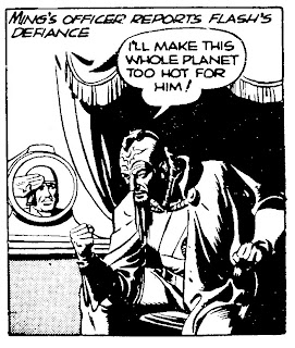
A rimlight keeps the light "inside" the drawing. The result is a natural light effect instead of an artistic gimmick like a halo. Like the last one, this technique requires forethought. If you don't plan ahead you wind up with an abomination like this William Overgard Steve Roper panel:
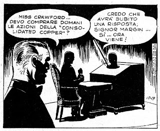
This could only have happened if Overgard had drawn and inked the foreground completely, then decided he wanted a solid black background. Since the story takes place in a darkened room, you'd think he'd have inked the background first so he'd know which foreground blacks he could afford to lose. Or he could have spotted blacks in the pencils, so he'd know where he was going when he began to ink.

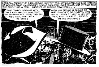
Working from dark to light is a great way to control blacks, but it's difficult to master and not many artists use the approach. Milton Caniff wrote that Noel Sickles worked dark to light, massing in all his shadows with a brush before indicating outlines with a pen. This work flow made panels like this possible:
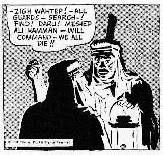
Had Sickles outlined in pen first, we'd see more linework in the light areas. Instead he used the barest of lines to hold the foreground figure's face. The shadow carries the rest. The speaker's face is made entirely of shadow. The one exception is the line of his chin. Leaving that line out would have let the face run into the drapery.

Caniff said he tried to emulate Sickles' approach but gave up in frustration and went back to outlining everything in pen. Having tried both ways, I can appreciate how he felt. However if you can master working dark to light, you open up a whole a new world: the world of "invisible lines." Rather than describe what I mean with words, I offer a panel by one of the world's masters of black and white, Arturo del Castillo. Devour this:Every time I look at this panel I drool. The massing of blacks borders on audacious. With an alternating pattern of darks and lights del Castillo gives the figures a full three dimensions. Hardly anything has an outline. The exterior contours of hats, heads and bodies are defined entirely by the shadows enclosing them. Where there's no shadow there's no line. The viewer's brain provides the line. The middle man's back is as solid as can be, yet most of its light side doesn't exist! And how about the face of the guy on the right? It consists of nothing but perfectly placed chunks of shadow. Wow!

Here's another del Castillo panel, in which he pushes the imaginary outline to its maximum. Take a look at the white hat at the left.That hat's crown has height, depth, and roundness. Yet it's not there! The crown is all in our mind...the only things on the page are two big chunks of black. No halos here. None needed!

For my money this is the sort of thing to aspire to. Think ahead. Bravely allow those black backgrounds to touch your figures. (Of course, as del Castillo demonstrates, being a genius helps.)