Showing posts with label advertising illustration. Show all posts

Friday, December 9, 2011

Albert Dorne, Illustrator


When Art Was His Oyster

Here is the earliest signed artwork I've found by legendary illustrator Albert Dorne. It appeared in Good Housekeeping magazine in December, 1926.

Dorne, you'll remember, was born in the New York City slums and began working to support his family when still a kid. His Wikipedia entry gives a sketch of his career arc from office boy to prestigious illustrator to founder of the Famous Artists School.

We all gotta start somewhere...Dorne would have been twenty years old when he drew this ad pushing the health benefits of oysters. It's competent, certainly, but looking at it one wouldn't have suspected the heights the artist would attain. The hands--later one of Dorne's specialties--are a bit clunky. Missing overall is the spirited mixture of realistic drawing and cartoon exaggeration that filled Dorne's illustrations with action and character.

One funny thing: he already had his signature down!I always felt that Dorne, who drew many continuity-style ads, would had been a heck of a comics artist. He just would have earned a few million dollars less during his career.

P.S.: I'd be interested to hear if anyone is planning to stuff their holiday turkey with oysters this year.

Friday, November 4, 2011

Ferenc Pinter, Illustrator

Pinter, Painter

It's clear from looking at my blog that I tend to like "classical" style illustrators: lots of realistic rendering and detail. So it's a surprise even to me that I like the late Ferenc Pinter's super-minimalist, super-designy illustrations so much.

What moves me is the audacity of Pinter's postery compositions as well as his inventive color schemes. If he needed to model something realistically--a face, perhaps--he'd do it. The rest of the time he let shapes and pattern carry the story. The results were magical.Born in Liguria and trained in Hungary, Pinter (1931-2008) fled the Hungarian Revolution and settled in Milan. After a while doing advertising and poster art, he connected with Mondadori, the giant publishing house, for whom he worked more than three decades. Among his most renowned works were covers for a series of crime paperbacks and, especially, for Georges Simenon's Inspector Maigret novels.I offer a smattering of his many covers. You'll find plenty more at his official website. Art dealer Claudia Salmin's Segni & Disegni seems to have had a connection with Pinter in his later years. They produced several prints by him, as well as offering some of his originals for sale. When you get to the site search "Pinter" and enjoy.

Friday, August 26, 2011

Swiping Then and Now--3

Two Bites of the Same Apple

In earlier posts (this one and this one) I discussed the honored tradition of artists swiping one another's work. While digging through my scrap file for a job I stumbled across this pair of images.

The first is from a personal-hygiene ad of the late 1940s (being a clipping I've no record of the magazine or its precise date). It probably advertised either Listerine or Lifebuoy, depending upon the offending body part. The signature appears to read "Ric Kelly." I presume it was painted in greys, but there may have been a color version.The second image came from a comb-bound lithographer's sample book from the mid 1950s. I wish I'd kept the book intact rather than razor blading it! But that was decades ago...anyway, this was presented simply as an example of good color printing. There was no headline or copy, just the picture. It's signed "Jack Klay." I haven't been able to make out the date. It looks like "47" but that would place it right about the same time as the original. I suppose it could be "57."Two things immediately strike me. First, it's a remarkably close copy. The location and shapes of the folds in the jacket and blouse strongly suggest that it was traced (projected, pantographed, whatever). The second thing is that Klay's painting of the faces, which differ somewhat from the originals, suggests he was skilled enough not to need to copy someone else's work. What was the story?

Wednesday, January 26, 2011

Advertising Comics, 1940

Comics Go Legit, Sorta

In an earlier post I presented some comic-strip-style ads that found their way into the New York Art Director's Club 1939 Annual of Advertising Art. In this installment I offer the three strips that appeared in the 1940 edition.

In those bygone days three kinds of comic-like strips appeared in American magazines and newspapers. The Art Director's Club lumped all three into one category, "continuities." In my blogs I limit "continuities" to the most common sequential ad form: a series of photos or drawings illustrating a story told in typeset captions beneath the pictures. These continuities tended to be illustrated by "classy" illustrators like Albert Dorne, Jon Whitcomb, and James Williamson. The second category, the least common, told the story comic style with balloons and captions, but used photos instead of drawings. The third group was the standard comic we know and love, drawn either by noted cartoonists or by anonymous specialists.

In the hallowed halls of the Art Director's Club, all three types received short shrift. In the Annuals a magazine illustration was often reproduced on a full page. Comics were crammed three to a page at the back of the section. Nonetheless, given the books' high-quality printing, it's possible to extract viewable copies. Of the three 1940 entries the halftoned Wizard of Oz strip suffers the most.

Note the blank spots in the Pep and Oz strips. This suggests they were reproduced either from originals or from early proofs taken before type and stock cuts were added.

This full-page ad introducting Wizard of Oz was drawn by Joe King. In my earlier post you'll find speculation about King, who may have been an eccentric painter--or just someone with the same name. I'd love to see this strip in print. This tiny (3-1/4 by 3-3/4 inches) repro looks really good. I get the impression that in the finished product there may have been typeset captions beneath the panels.Next is an outing with The Captain and the Kids (or was it the Katzenjammer Kids?) credited to Rudolph Dirks. Advertising agency Kenyon & Eckhardt, Inc. produced it for Kellogg's All- Bran cereal. If you read the copy you'll find All-Bran is promoted as a laxative.Finally an energetic geezer named J. Fuller Pep teaches a bunch of kids the glories of Kellogg's Pep cereal. I don't know if J. Fuller was a continuing character. I've never seen another strip featuring him.Another Kenyon & Eckhardt project, the Pep half-page originated at the Johnstone & Cushing comic art studio. These Annuals are useful because sometimes they reveal the names of unsigned commercial artists. Not this time. Only the studio receives an art credit. Has anyone ever seen it in print?

Sunday, June 7, 2009

Technique Talk

Hail the Hallowed Halo
Many years ago Jim Vadeboncoeur and I interviewed the late John Buscema about his early career. At one point I asked him why he and other comic artists of the 50s and 60s put "halos" around characters rather than letting a black background touch them. Here's an example of what I mean, from a Golden Age Ruben Moreira story:
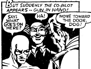
The halo preserves the outline of the co-pilot's face. In the printed comic the effect might be subdued by running a dark color over the halo so it becomes part of the background:
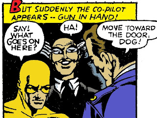
Too often comic book colorists chose a bright color, giving the character a radioactive glow:
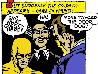
When you look at it closely, though, the halo wasn't necessary. Had Moreira left the guy's nose open instead of in shadow, the background could have met the face and the face would have read just fine.

But comics artists often used halos when outlines didn't need preserving. Here's a particularly egregious example from Milton Caniff, who of all people should have known better. [Sidebar: I'm not convinced this is 100% Caniff; I suspect ghost work.] With the exception of Terry's left arm and Dude's shirt front, none of these edges needed saving. The halos here were apparently artistic, not practical, choices.
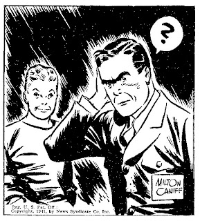
As for Buscema, he shrugged halos off as a stylistic trick comic artists adopted from illustrators they'd admired in school. This intrigued me, so I pulled out some tearsheets and went looking for halos.

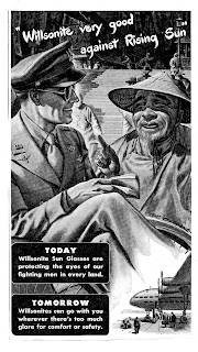
I found quite a bit of evidence to support Buscema's theory. Many illustrators lightened the areas around characters, especially around their heads. Here are a couple of 1944 advertising examples.
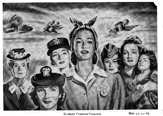
The group of women is from an ad for Eureka vacuum cleaners. Note how each head is haloed. I understand using a halo to highlight the main figure. But halos don't make sense on the secondary figures, like the elderly woman and the one with the cap to the main figure's right. In the full-size reproduction we see that the grey background tones are hatched in with a brush, just like Caniff's black background.

In another ad, one pushing Wilsonite sunglasses, W. Calvert also uses a halo to emphasize the main character. I confess I reproduce this ad not only to show its artwork, but also to share the wonderfully-awful wartime pun in the headline. Anyway, consider the halo around the aviator. It certainly draws attention to the his face, the most important part of the picture. Unfortunately it also eats away much of a background figure. This partial figure looks really weird. Calvert would have been wiser to move him further back and to the right--or to leave him out altogether. I speculate that this figure was indeed fully painted at first. Calvert might have sponged out the halo later to prevent the background interfering with the aviator's head.
Which led me to wonder if some comic book halos weren't style at all, but the result of insufficient planning. Consider how a cartoonist can handle a large foreground black area. The classic choice is to position it against a white (or grey) part of the background. But what if the background is also black? There are two options. We can deliberately lose the foreground black into the background. George Tuska did that with Buck's hair in this Buck Rogers daily:
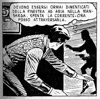
As long as you plan the black areas properly, the viewer will understand the drawing. As we'll see later, you can lose quite a bit of foreground black without your drawing becoming unreadable.

The second way to avoid losing a foreground black is to provide a rimlight to illuminate the endangered spot. That's what Austin Briggs did on Ming's helmet in this Flash Gordon panel:
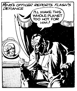
A rimlight keeps the light "inside" the drawing. The result is a natural light effect instead of an artistic gimmick like a halo. Like the last one, this technique requires forethought. If you don't plan ahead you wind up with an abomination like this William Overgard Steve Roper panel:
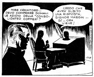
This could only have happened if Overgard had drawn and inked the foreground completely, then decided he wanted a solid black background. Since the story takes place in a darkened room, you'd think he'd have inked the background first so he'd know which foreground blacks he could afford to lose. Or he could have spotted blacks in the pencils, so he'd know where he was going when he began to ink.

Working from dark to light is a great way to control blacks, but it's difficult to master and not many artists use the approach. Milton Caniff wrote that Noel Sickles worked dark to light, massing in all his shadows with a brush before indicating outlines with a pen. This work flow made panels like this possible:
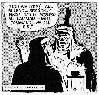
Had Sickles outlined in pen first, we'd see more linework in the light areas. Instead he used the barest of lines to hold the foreground figure's face. The shadow carries the rest. The speaker's face is made entirely of shadow. The one exception is the line of his chin. Leaving that line out would have let the face run into the drapery.

Caniff said he tried to emulate Sickles' approach but gave up in frustration and went back to outlining everything in pen. Having tried both ways, I can appreciate how he felt. However if you can master working dark to light, you open up a whole a new world: the world of "invisible lines." Rather than describe what I mean with words, I offer a panel by one of the world's masters of black and white, Arturo del Castillo. Devour this:Every time I look at this panel I drool. The massing of blacks borders on audacious. With an alternating pattern of darks and lights del Castillo gives the figures a full three dimensions. Hardly anything has an outline. The exterior contours of hats, heads and bodies are defined entirely by the shadows enclosing them. Where there's no shadow there's no line. The viewer's brain provides the line. The middle man's back is as solid as can be, yet most of its light side doesn't exist! And how about the face of the guy on the right? It consists of nothing but perfectly placed chunks of shadow. Wow!

Here's another del Castillo panel, in which he pushes the imaginary outline to its maximum. Take a look at the white hat at the left.That hat's crown has height, depth, and roundness. Yet it's not there! The crown is all in our mind...the only things on the page are two big chunks of black. No halos here. None needed!

For my money this is the sort of thing to aspire to. Think ahead. Bravely allow those black backgrounds to touch your figures. (Of course, as del Castillo demonstrates, being a genius helps.)

Monday, May 11, 2009

Walter Jardine, Illustrator

From Alfredo to the Indies in Your Undies
The late, great Alfredo Alcala often cited J. C. Leyendecker as a major influence on his work. When we asked him about Walter Jardine, he always hemmed and hawed. Maybe he was hoping to keep Jardine to himself. Until recently about the only place one could find Walter Jardine's work was in Arthur Guptill's Drawing in Pen and Ink.

During a recent expedition through 1926 Collier's magazines I discovered this beautifully-rendered (and rather oddly-conceived) Jardine drawing in an ad for B.V.D. undergarments.
The cultural subtext of this illustration simply begs for deconstruction. Here are three strapping gents (Englishmen, probably) lolling about in their undies while an obsequious, turbaned native serves them tea. It's okay for him to see the sahibs in their skivvies because he's after all just a servant. The "white" gentlemen don't even notice him. What are they discussing? Cricket? Tiger hunting out in Indi-yah? And just how are we supposed to answer that saucy question, "What's back of that B.V.D. label"?

I feel these questions bear asking because of a smaller Jardine B.V.D. ad in a later issue. Unfortunately my scan screwed up. I'll have to go back to the library to get a post-able image. This ad shows two manly Americans in a forest. They stand by their tent, wearing only their undies, listening to records on a wind-up phonograph. "Next to myself," the headline reads, "I like B.V.D.'s best." Shades of Brooke Shields and her Calvins! The copy on this ad informs us, "The test of underwear comfort is to be able to forget you have underwear on!" Hmm. Are these guys forgetting?

Speaking of Alcala, the middle Englishman's face is about as Alfredo as an Englishman can get without turning Filipino.