Showing posts with label Dell comics. Show all posts

Saturday, March 30, 2013

Alberto Giolitti's Gunsmoke

The Guns of Alberto
Many years ago, another fan, whose identity I've regrettably long since forgotten, sent me Xerox copies of a number of Alberto Giolitti originals. Here are scans of some nice work for Dell and Gold Key.

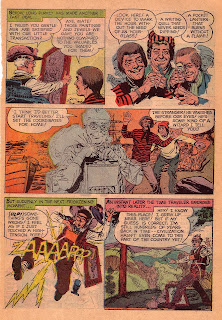
These two panels came from the inside front cover of an issue of Dell's Have Gun, Will Travel. Dell often presented illustrated synopses of an issue's stories on the IFC. They commissioned new art for these summaries rather than re-using story panels.


The panels showcase Giolitti's control of composition. Both panels are complex, yet they're clear and readable. Check out the distribution of blacks in the second panel. Giolitti plays with the light source in places, but the overall effect is dramatic and believable.

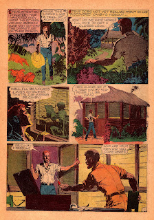
The rest of the scans came from  Gunsmoke #1, the first issue under the Gold Key banner. This art seems to have been drawn more quickly than Have Gun. Despite this, Giolitti's drawings are solid and he doesn't skimp on backgrounds. Numerous sources mention that Giovanni Ticci assisted on Giolitti's later work. Judging by art which has documented Ticci input (King Kong, for example), he may have worked on this issue. Comparing this to Ticci's solo Italian work, I'm pretty sure the figures are all Giolitti.


Thursday, March 10, 2011

George Evans—Artist

Lost “Interview” with George Evans

While sifting through the endless piles of crap in my garage/midden I rediscovered something I never thought I'd see again: one of the two letters sent to me in 1974 by one of my favorite comics artists, George Evans.

Evans was one of those artists who spent a lifetime producing beautiful work, yet was always under-appreciated—mostly because his quiet style seemed dull in the light of flashier contemporaries like Wallace Wood and Al Williamson. Evans started drawing in the 1940s; drew comics for famous publishers like Fiction House, EC, Fawcett, and Dell; and ghosted George Wunder's daily Terry and the Pirates for decades before inheriting Secret Agent Corrigan from Al Williamson.

In the 1970s I was out of college and trying (unsuccessfully) to assemble an article about movie and television tie-in comics, particularly those published by Dell in the 1950s and 1960s. I wrote three men who'd worked on them: Alex Toth, George Evans, and Frank Thorne. All three responded kindly—and at length—to my questions. Evans was the most pleasant surprise of all. His letters were long, friendly, and chatty, providing loads of background information. The Toth and Thorne letters are long gone. Fortunately the surviving Evans letter contains much information about his varied career.

Following are excerpts from his letter of April 8, 1974. I've inserted italicized comments explaining my original questions. I hope genuine comics historians will find something to help them in their research.

First I asked Evans about how he became involved with Dell and how he went about adapting movies to comics.


Initially I did some stuff for Western which was an affiliate of Dell, or at least they worked together, though with separate editorial offices and people. At Classics [Illustrated] near the end their editor was Leonard Cole, who went on to Dell and asked me to go with him.
Panels from Oliver Twist, a Classics Illustrated issue Evans
drew with Reed Crandall

The first movie-related stuff I did was When Worlds Collide for Fawcett. Then the TV-related Captain Video. On WWC they just gave me a slew of stills, some of which I still have. I'd read the book and saw the movie, so with the stills, stayed close to what had been done. At Dell, they got stills, too; sometimes sheet after sheet of photo-size stop-action stuff, which is what they gave me for Tales of Terror. But they let me just interpret it loosely along the movie line, so I hammed up some of the stuff—and it was well received, so I guess if you have fun doing something, it helps communicate.
A page from one of the short stories in Dell's
Edgar Allan Poe's Tales of Terror (1962)

I asked whether he had begun to work with George Wunder at the time he was doing Twilight Zone, having noticed what I thought was Wunder influence in his work. He turned out to have started even earlier.

At Tales of Terror I had just begun to work with Wunder, through a quasi-agent named John Lehti; also, he was a cartoonist, and he abetted the inking of the last story there. And he was the one supposed to do Ivanhoe, but bogged down, so it was a botched and butchered patch-up job. I can't even recall which parts I did. I think he'd done bits everywhere that he had swipes for, or that fitted his abilities, and I hacked to a boring finish.

I asked him about his collaborations with Reed Crandall, which enlivened many a Classics Illustrated as well as Twilight Zone stories.


Reed and I held over from Classics. Reed had gone back to Kansas to help look after his mother. I special-air-mailed rough layouts to him; he put them in inking shape and zipped them back. We were pretty fast as a team, so somehow made our deadlines. Mail was faster then...and far more reliable, and much cheaper, too.
This page from an unidentified Twilight Zone story
was penciled by Crandall and inked by Evans;
both men were at the top of their form.

One time though he threw me a curve. I had penciled for him to ink, but he turned it over to a Frank Borth. And Borth simply inked what he felt like of the pictures, and erased what he'd left un-inked. I spent a lot of time putting it all back together myself. It was the semi-humor story to a Twilight Zone, and Reed had wanted a vacation—and Borth was a humor-cartoonist he thought he could trust.
I believe this story from Twilight Zone #4 (1962) was the one Borth worked on. Many of the character faces appear to have been touched by someone else. An interesting sidelight: half the final page was dropped to accommodate an advertisement. It wasn't until a reprint several years later that the page appeared in its original form.

I asked Evans if he could drop any names of editors or writers. Alex Toth had suggested Kim Aadmot wrote for The Frogmen, so I asked about him as well.

I worked through Len Cole, as noted. If others edited or whatever I never met them. In fact, Len lived at the edge of N. Y. City and would bring the stuff out so I could avoid the hassle of going in and wasting the extra time. Two names only come back to me as writers: Leo Cheney (think that's spelled right) who did the Twilight Zones and much s-f stuff. And Don Siegel (Sei-gel?) did The Frogmen. Don't know if he's the Don Seigel who is now a reputable name in movie making. Don't know Kim Aadmot. If he wrote Frogmen, it was after my time.

I was a great fan of the early Frogmen comic. I was puzzled about why the book's concept changed completely between issues: in the beginning the two heroes had families and kids and ran a skin-diving shop in the Northeast. At the time Evans left the book the families suddenly vanished without a trace and the heroes became globe-trotting adventurers.


Why did they change that? I have no idea. Maybe Mike Sekowsky just told them he wasn't drawing whole tribes of people. He seems to have a lot of clout in the business, and many friends, so it's a possibility [Actually Sekowsky took over after single issues drawn by Don Heck and Alex Toth]. Me—I get involved with the people I draw, and really thought of those two families as neighbors. Crandall helped me on the first couple—or the first, for sure.
This page from The Frogmen's first issue (O.S. 1258, 1962)
clearly shows Reed Crandall's pencils. The kids belong to the

two heroes' families, as discussed above.

I had been trying to identify the inker on the first Brain Boy and wondered if it had been Evans (I cringe to admit this).

No, I never inked anything of Gil Kane's, though he once phoned to ask me to do same. That's not my idea of things. Half-an-artist or less! I'd rather be a bad one on my own! Didn't do any writing on Frogmen, but sometimes Len and I talked about them, and sometimes in a story a faux-pas would turn up that I'd pick up and he and Siegel would smooth them out. Yes, Frank Frazetta helped me on a few pages of Frogmen, and quite a lot on the last Twilight Zone. He had just parted company with Al Capp, for whom he'd penciled the Sunday Li'l Abner for years. One of Capp's people had had a stroke, and out of a clear sky he ordered Frank to drop everything, move up to Boston and go full-time as a Capp ghost. Fortunately, Frank had the guts to say no—though he knew it was an instant cut-off, and he had a new house, a young family...He scraped by with his comics work while painting up the samples that launched his painting career. I'd turn green with envy watching the facile way he swept in color...
From The Frogmen #2 (1962) comes this knockout
example of Frank Frazetta lending his special touch
to the inking.

From Toth and Thorne I'd heard interesting stories about restrictions on likenesses and other contractual nonsense. I asked Evans about his experiences.

I don't know about all the technical and contract details, but of course they had to negotiate regarding copyrights. Use of stars' likenesses was probably covered in the stars' contracts with the studios. Probably they got nothing extra, in the same way Laurel and Hardy got not a cent extra as they became the most popular comics on TV.

It was possible to have at least some of the films run at private showings. Not bang-bang; but when a group of somehow-involved people (cartoonists, advertisers, critics, etc.) could be assembled. I saw the Hercules stuff that way. Became a big man in my older daughter's eyes when I magnanimously took her with me—and she gloated about it around the neighborhood kids! Other stories they sometimes got the entire storyboard from the film company's art department. I saw the storyboards for 20,000 Leagues etc. or some undersea story. On charcoal paper with litho pencil. Loose but very handsome. I was surprised they weren't in color. Wonder if there was another in color—as for color movies you'd think there'd have to be planned color composition.

Stills were given but so far as I know, didn't have to be followed, though doing so made easier work. Likenesses were never questioned, at least to me. And since I saw many books that simply used the assigned artist's “standard” faces, with only a slight bow to actual actors, I guess no one cared. Maybe they preferred that. How could the stars make trouble if they weren't used?
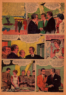
From O.S. #1328, The Underwater City (1961). Not the best page
from the book, but chosen because George Evans invited himself
along on the government's inspection tour of the undersea installation.
That's him in the green suit in panels 3 and 5.

I asked about his adaptation of a minor film, The Underwater City. This comic was another personal favorite.


I did Underwater City on my own, completely. Did enjoy it, though afterwards felt I missed the likeness to the hero, Wm—who? [Lundigan]. So far as I ever knew, it had no connection with my doing Frogmen, but then it might well have in the editorial rooms. I don't do any diving, but I am spectator-interested, and among the neighbors some of the athletic types dive, and we quacked a lot about it; and of course equipment was available for reference. The shore is only nine miles off here, and there's a lot of surfing and diving. Was, anyway, when I needed reference. It's getting polluted, too—so maybe it'll be kaput, too. But lotsa boats of all kinds, all the scenery. And many completely fruitless fishing expeditions with friends on various boats all went into Frogmen.

A beautiful page from The Frogmen #3 (1962).

Did he like doing movie comics any better than other books?

Depended on the story. I always yearned to do things like the James Bond stuff—or the “Flynn” ones [I think he was referring to Our Man Flint]. But one editor told me the girls I drew were not slutty enough for that sort of thing. Don't know whether that was praise or criticism.


Have had discussions on comics related to movies or TV characters. Including with Wunder. It's a really tough question. Takeoffs on one-shots possibly have a place—but then I think the story should sort of take-off from the movie story, just as movie versions often veer away from successful novels on which they're based. To just re-tell the same story—especially using the same stills as basic pictures—would seem dull. That's why I tried to ham it up, or make it a little more expansive. Adaptations of successful series characters to series comics would seem to me too much maturation—and bad for both. Any failure on the part of either turns the money-oriented producers sour. And yet I do think some comics should have continued around series characters even though the TV thing failed. Or was slaughtered. Star Trek as a perfect example.
It's not a movie book, but to wrap things up I couldn't resist
adding this page from Evans' Classics Illustrated retelling of an urban legend
about a ghostly hitchhiker.

I think the best idea for comics is to originate stories that go beyond where movie or TV stories go. I don't mean that in the curent sex and/or slaughter stuff, for I don't see how you can go any farther with either! But as an example, the funny story that was always included in the Twilight Zone. Nothing was too ridiculous, as long as it could be drawn, where making props for the TV version would've been too expensive, and too phony.

Dell was good to me, though as said back yonder I dealt only with Len Cole. I was much closer to the affiliated Gold Key, and really liked the group of people up there. I hope that was mutual. In fact, I must say that among the comics publishers I have worked for I've found very good people. I understand that was not so in all companies. I was lucky—and I was a little bit choosy, too; and, of course, friends in the business—artists, writers—steered me to the good people. People like that are good friends.

*****

Just reading his letters you knew George Evans was a nice guy. Everyone I've seen quoted who knew him confirms that fact.

In closing let me point out that he seems to have got the Dell/Gold Key thing slightly muddled. The Hercules book he mentions and the Twilight Zone one-shots were published by Dell Comics when it was still connected with Western Printing. However Frogmen and the Tales of Terror adaptation was done after Dell and Western had parted company. As I understand it, it was during this period that Leonard (L. B.) Cole was editor. The non-Western Dell continued the numbered One Shot series for a while but soon switched to releasing tie-ins as unnumbered issues.

There seem to have been two distinct periods of non-Western Dell. The first (the Cole period?) is known for off-beat series like Brain Boy, Space Man, and Kona. Most still featured painted covers. Frank Springer, Paul Parker, Gerald McCann, Jack Sparling, and Sam Glanzman were among the artists.

At a certain point the line changed again: painted covers were replaced by line drawings, ongoing series were canceled, sometimes after a couple of reprinted issues; and writing and art teams changed. Some earlier artists like Springer and Sparling continued with the new Dell, but the new crew featured many names familiar to Charlton readers: Sal Trapani, Tony Tallarico (with Bill Fraccio), Dick Giordano, the Vince Colletta studio, Steve Ditko, and writer Joe Gill. During this period Dell experimented with new series like Nukla, Super Heroes, and Flying Saucers. Most died after three or four issues. I speculate that the change was due to a change in editorship from L. B. Cole to D(onald). J. Arneson. At least it was Arneson who signed a reply to my letter of comment regarding Nukla. But that's a subject for another time.

Wednesday, March 24, 2010

Alberto Giolitti, Artist


A Glimpse at Studio Giolitti
Italian artist Alberto Giolitti (1923-1993) was one of my earliest comic art influences. I didn't know his name, because he never signed anything, but I loved Giolitti's dramatic, realistic art on titles like Sgt. Preston, Turok, Indian Chief, and TV and movie adaptations. I followed his path from Dell to Gold Key (where I finally learned his name), studying and swiping his figures. (At right, photo of Alberto Giolitti)

Giolitti had a long, remarkable career which took him from Italy to Argentina to the United States, then back to Italy where he set up a comic art studio. The operation grew to employ more than fifty artists, producing comics for Germany, England, France, the USA, and Italy.

Rather than repeat Giolitti's biography, I strongly recommend the official Alberto Giolitti website, maintained by his friend and co-worker Angelo Todaro as a tribute to this influential artist. The site not only has complete biographical information but also a gallery of comic stories and original art that Giolitti produced during his career. (At left, Sgt. Preston from 1954)

I'm interested in the Giolitti art studio because I'd seen many of its products over the years without knowing where they had come from. Studio work appeared in the second German Perry Rhodan series, countless English digest-size war comics and comic papers, the Whitman Starstream s-f series, and even the notorious Italian erotic comics like Oltretomba and Jacula.

Studio Giolitti opened when the artist returned from America in 1962. It seems to have petered out around 1989--Todaro is vague on this point. About the time the studio opened, Il Vittorioso, the long-running youth paper backed by the Catholic church, went belly up. A large group of veteran creative people were suddenly out of a job; many found employment with Giolitti.

Recently I obtained one of ANAF's limited edition reprint books, La Pattuglia Bianca ("The White Patrol"), collecting a Mountie series Franco Caprioli drew for France through the Giolitti studio. Caprioli was one of the legends of Il Vittorioso, and deserves a hundred articles all to himself. Gianni Brunoro interviewed the artist's daughter Fulvia for the book's introduction. Her father had always freelanced from home, so as a girl Fulvia had shared the ups and downs of the artist's career. In her interview Fulvia Caprioli gives a snapshot of Studio Giolitti in its early days. I've translated the relevant parts for you Anglophones out there. I think you'll find it interesting. (At right, a page from Turok, Son of Stone)

Ms. Caprioli begins with the failure of Il Vittorioso.

"The 1960s were really 'critical' years for our family (and perhaps for similar families of 'old guard' Italian artists). Conflict was in the air, a crisis of certain values upon which, whether they believed them or not, older generations--among them the one to which Papa belonged--had based their lives. The wind of 'revolution' penetrated even art and comics. The world was changing rapidly, technology was advancing, everyone was getting richer. And we were always getting poorer."

(At left, a prewar Il Vittorioso with Kurt Caesar art)

"In 1964, Il Vittorioso was in bad shape; it was going to shut down, so many of the paper's artists, among them Ruggero Giovannini, Renato Polese and others, presented themselves to the 'Graphic Studio of Alberto Giolitti' (as well as the editors of various newspapers, like Il Giornalino) looking for work. Papa went there, too, probably tipped off by one of his colleagues. The main reason my father accepted this work is that he was 'unemployed,' like all the other Il Vittorioso artists."

Ms. Caprioli mentions Giolitti's wife of many years, Joan, whom the artist had met while working in America. Mrs. Giolitti seems to have been the studio's business manager. It seems that Studio Giolitti shared one characteristic with many other art shops: lack of money.

"Alberto Giolitti had an art studio on the Via della Magliana, in Rome, where several other Il Vittorioso artists were working, mostly for the foreign market: France, England and Germany. Alberto Giolitti had married an American, who functioned as 'manager' and maintained the business relationship with the foreign publishers, particularly in England. I would go to the studio with Papa when he had to turn in his work. It was a somewhat squalid place, on the outskirts of town; there were still farms around it.

"I remember Alberto Giolitti well: the classic 'Romano,' dark, not too tall, with a lively face, a bit superficial. His father had the famous 'Gelateria Giolitti' in Rome. I also recall that many times Giolitti sent Papa home without having paid him. In fact once--and perhaps I shouldn't say this, but it's the absolute truth--we returned home on foot (hours and hours of walking!) because Giolitti hadn't paid Papa, and we didn't even have the money to take the bus. Stories of times gone by, almost 'unbelievable,' but true all the same."

Giolitti asked Caprioli to work at the Rome studio, but the artist preferred to stay at home. Working for a studio rather than a publisher was a difficult transition for Caprioli, who always took a very personal interest in his art.

"When he was doing stories for France, he continued to work as he always had, from home. Certainly, he missed the direct contact with the publisher because, even though he talked with Miss Ratier [the French editor] on the telephone, everything else was done through Giolitti. He never even had the satisfaction of seeing his work in print. You can imagine what it did to the soul of an artist like my father, to see his work, executed with such love and care, mysteriously disappear into the 'exterior,' without ever knowing anything about it: whether the readers liked it, and so on. The pages paid very little."

Unlike American shops of the forties, which broke jobs into assembly-line pieces, Studio Giolitti seems to have followed the European tradition of assigning artists jobs which they produced alone. Of course this doesn't mean the artist didn't sometimes use assistants. However the shop-style system of several artists working on a single page seems to have been rare.

Brunoro asked Fulvio Caprioli how Giolitti came to select her father to draw The White Patrol.

"Papa was already well known and appreciated in France and other foreign countries. His stories were even reprinted in Siam! ... The second reason was that Papa was fluent in French, which Giolitti wasn't. Perhaps he chose my father thinking that Papa would get on well with the scripts, which were sent in the original language."

Alberto Giolitti died in 1993. He was working till the very end, leaving behind an unfinished Tex story for Bonelli. A long list of artists, both old-timers and newcomers, had passed through Studio Giolitti's doors. The once-anonymous artist had impacted comic art in half a dozen countries. (At right, Tex by Giolitti)

Wednesday, February 24, 2010

Storytelling--1

Plus That Script!
In an interview given many years ago, Alex Toth advocated that comic artists should "plus" a script when converting it into drawings. The term comes from animation, and refers to enriching a story by inserting visual bits--background details, poses, actions--that don't appear in the script.

It's similar to what happens in movies. If a scene features two actors talking, the actors seldom just stand there and yak at each other. They'll perform some sort of business that tells something about their character while adding movement to a static scene. For some reason, though comic artists frequently enliven scenes with interesting camera angles, they often don't go much further.

Recently I re-read two stories that showed what a master Toth was at plussing a scene. One was from the 1970s, when he was drawing romance stories for Charlton; the other is a Dell movie adaptation from the late 50s. Before looking at the Toth panel, let's look at a typical dialogue exchange from another story in the same issue. The penciller is Charles Nicholas.
This setup tells the basic story well enough, but the eye-level camera and static poses lend the scene a generic look. The impression isn't helped by the casual background. This room has no personality; it could be any room anywhere. Now let's look at how Toth illustrated a dialogue exchange that could easily have been presented in the same way:Not much happens in this panel. The narrator (a movie star) drives away while her friend and the guy they both love discuss her departure. But the panel is exciting because everything Toth draws gives the scene a unique personality. Instead of a generic house Toth has created a "Bel Air mansion" appropriate to a temperamental movie star. He stages the scene in deep perspective. Matt strikes a dynamic pose we understand without needing to see his face. The star is driving off not in some generic car but an expensive Porsche. Its cockpit is crammed with luggage. All the smaller background details--the shadow of palm trees, the cobblestone street, the tile roof--shout "Southern California Richville." This scene has individuality, and the story is better for it.

Creating well-thought-out backgrounds is a great way to plus a script. Consider this panel from the Dell adaptation of Clint and Mac, a youth-targeted mystery-adventure set in London. It's easy to picture the script for what might have been a throwaway panel. Smith, the guy in the trench coat, returns to his apartment expecting to meet his accomplice Toby. Smith calls out but Toby isn't there. Here's how Toth interpreted the scene:
This panel is an entire book about Smith. As written the character is a typical bad guy without much depth. But when composing this scene Toth asked himself, "Who is Smith? How would he live?" So we see a cheap, impossibly cramped room with wet laundry hung over an old-fashioned stove to dry. A couple of magazines are thrown onto the rumpled bed. He's not a total slob, though: while his clothes are tossed over a chair, his dishes are done. Smith (like Toth) is apparently a car fancier: other than the calendar his only decoration is a print of an old automobile. The blind is pulled halfway down; Smith dislikes either the sunlight or prying neighbors. Smith has become a real person. This is what plussing a script is all about.

Still one might ask, "Is there a point to this?" It's a fair question. After all the Clint and Mac panel really was incidental to the story. Its basic idea could have been got across in a simpler way. Is Toth just showing off? Comics as a medium are admittedly less involving than movies. People tend to read them quickly without scrutinizing each panel. However I believe that, just as happens in movies, thoughtful plussing subliminally adds to a reader's experience of the story, allowing him or her to take away from it more than was originally there.

Wednesday, August 26, 2009

Dell TV and Movie Comics--1


Crawford in the Comics
King of Diamonds was a short-lived American TV show from the early 1960s. It wasn't much. I watched it because I liked its star, Broderick Crawford, with whom I'd grown up watching Highway Patrol. John King, the protagonist, was a tough private security agent who worked in the diamond industry.

In 1962 Dell Comics published a one-shot comic based on the series. This was the period during which Dell, having separated from Western Publishing (which in turn created the Gold Key line), was going it alone. It was an interesting period for Dell. While they continued a decades-long tradition of publishing media tie-ins, their choices were often odd (e.g. Michael Shayne, Private Detective, set in its original World War II era). They also launched their own titles, some of which have become cult favorites--Kona, Monarch of Monster Isle and Brain Boy, for instance--but are remarkable both for their oddball subjects and their downright strange scripts.

I have read that L.B. Cole was editor during this period, though a fan letter I sent to Nukla was answered by D.J. Arneson. They may have gone through more than one editorial regime. The artist roster, which often changes with a change of editors, began with upper-middle-level artists like Mike Sekowsky and Bob Fujitani. By the Frankenstein/Dracula/Werewolf days, almost the only artists left were Tony Tallarico (with Bill Fraccio) and Jack Sparling, both famous for drawing for the worst-paying companies.

King of Diamonds was pencilled by Mike Sekowsky, and it featured the sort of things Sekowsky was best at: real world settings and guys in suits. While the artwork obviously sped up a bit in the latter pages (backgrounds began disappearing), Mike still did a nice job. He was served especially well by the inker. For years I believed the book was inked by Bob Fujitani. This still looks likely, especially in the earlier pages. However Sy Barry could have been in there, too, as could the prolific Bernard Sachs. Sekowsky's strips were often split up among inkers (especially if they were assigned to Frank Giacoia, who was a one-man splitting machine). Whoever it was, between them Sekowsky and the inker(s) did a damned nice likeness of Broderick Crawford. For that alone they get five Smurfswacker stars.

I sold my Dell collection years ago to pay the rent. The examples on this page are from the excellent fan site "Beware, There's a Crosseyed Cyclops in my Basement," which has recently been posting scans of many of the post-Western Dells.

Saturday, April 25, 2009

Alden McWilliams in Spaaaaaaaace!

Corbett in (Four) Colors
Ger Apeldoorn has been doing us the favor of reprinting stories from Mort Meskin's Tom Corbett: Space Cadet comic books. As he mentioned, Dell published its own series of Tom Corbett books, beginning with three issues in its Four Color series (#s 378,400. and 421), then continuing as a quarterly series series for eight more issues.

The regular series is usually dismissed because the stories were dull and the artwork weak. Both charges are largely correct. They were drawn in one of those competent but deadly dull leftover- Golden-Age styles. Unlike the Four Color issues, the series stories quickly dumped the show's Outer Space trappings. The cadets' spaceship was just a convenient way to travel to a distant planet. Once there they acted out a generic fantasy adventure that could as easily have starred Tarzan or Turok. In at least one issue they didn't even make it back to the ship before the mandatory closing joke.

However they did have great cover paintings! Here's the one from issue four.

The Four Color issues were another matter. They were drawn by Alden McWilliams, legendary Raymond-school illustrator who drew thousands of pages of comic books and strips, ghosted for everyone in the universe, painted for galleries, yet never managed to be listed among the "big guys" by comics fans.

Alone among 1950s space comic artists, McWilliams played up the lack of up and down in space. His spacemen stand upside down or sideways on the hulls of their ships, casting long shadows suggesting the high-contrast lighting writers used to tell us we'd find beyond Earth's atmosphere. His interiors were less imaginative: the engine room looks like that of an earthside steamship. But that wasn't unusual; pulp magazines had only just died out, and their pipe-and-bolt science-fiction tradition was still strong.

The stories were by Paul S. Newman, that incredibly prolific writer of increasingly-bland comics stories. His Corbett stories weren't that bad, and they exploited common kids' s-f themes: space pirates, space colonists, and space battles. They were certainly more space-specific than the series stories. They were extra-long, like many Dells of the period. The story filled not only the 32 interior pages but also the inside (in b&w) and outside back covers. I hated that as a kid. If a friend traded you a coverless copy you never got to see how the story ended!

Here are some sample pages from issue 400. I found them thanks to a comment from "tom" on Ger's blog. They came from the wide-ranging collection at Comicsworld (comicsworld.wordpress.com) which has a wonderful collection of Four Colors. (Unfortunately they're hosted on one of those download sites that try to force you into paying for "premium" service by limiting your slow downloads to one every 15 minutes.)

The deep perspective in the last panel of the first page (page 10) really gives an impression of weightlessness and the great distances in space. It also suggests an interesting gimmick that McWilliams develops more thoroughly on a later page (page 15, seen below). He apparently figured space cannon would be heat rays. Instead of twisted ragged metal, the outcome of the ray blast above was oozing blobs of molten metal. It's a neat effect, if a bit odd. Too bad the exhaust nozzles look like holes drilled in a piece of wood.

The third sample page (page 26) shows some nice characters amongst the pirate gang, including a couple of beautiful women. Even in a squeaky-clean Dell comic, Al managed to get in some sexy babes.

If you're interested in seeing the entire book, I suggest you visit Comicsworld. 36 pages are a bit more than I want to post right now.

One nice thing about comics based on TV shows and movies was that unlike their inspirations, the comics had no limitations to the "budget" for sets and special effects. Sadly only a few Dell artists took advantage of this--Alden McWilliams, George Evans and Reed Crandall, and Alberto Giolitti come to mind. Most Dell illustrators tended to cheat on backgrounds and favored pedestrian compositions. Nonetheless I love these comics. I grew up on Dell movie and TV comics the way other kids grew up on EC or the silver age DC superheroes. You'll see them pop up here from time to time.