I am impressed-- but hardly surprised-- at the incredible superficiality of the objections recently raised by Milo Manara's "variant cover" to SPIDER-WOMAN #1. Here's the much critiqued cover:
This BEAT post happily reprints a translation of Manara's response. Since I've been recently expounding on theories regarding the evolution of female
homo sapiens, particularly
in this essay, readers of this blog may anticipate that these Manara comments would get my equivalent of a "high-five:"
it’s not my fault if women are like that. I’m only drawing them. It’s not me who made women that way: is an author much more “important”, for those who believe … For evolutionists, including me, on the other hand, women’s bodies have taken this form over the millennia in order to avoid the ‘extinction of the species, in fact. If women were made exactly as men, with the same shape, I think we would have already been extinct for a long time.
Most ultra-feminist posters will not deal with weighty questions of the extent to which "biology is destiny." For most of them, the matter is purely one of marketing to a male demographic, and so offends against the injunction: Thou Shalt Bow Down Before the Buying-Power of the Female Fan.
THE MARY SUE comments:
The series is being written by Dennis Hopeless with art by Greg Land, and although it appears Marvel is attempting to draw in women with a slew of new female-led titles, this does not instill confidence. Nor does it tell women this is a comic they should consider spending money on. In fact, what the variant cover actually says is “Run away. Run far, far away and don’t ever come back.”
Manara-- who claims that his regular work doesn't seem to make his clique of female fans run away-- goes on to situate the question as one that cannot be reduced to simple ideology, by virtue of his observation that women's bodies evolved to exhibit sexual attractiveness.
I don’t know if this character will also become a movie, but it does, I think they would have their sweet problems to make her do what Spider-Man does (frame her in the same vicissitudes and athletic performance and so on) without her becoming seductive. If she’s played by an actress endowed with an ass, it is clear that her ass will be seen. I0m reminded that her tights are “painted on” … I also noticed that some website says that more than a suit, what you see in my drawing, it’s body painting. It’s true. Sure it is. But because it is so in all the superhero comics: These tights are painted on them. You don’t see a crease, a wrinkle. You read the muscles perfectly.
Now, I've stated that I don't think any human being is defined entirely by biology. But suppose we begin with the postulate-- as I believe even Kelly Thompson has admitted-- that most audiences prefer to read about good-looking heroes. If one also grants the previous postulate that women's bodies evolved to spotlight their sexual nature, then it would seem all but inevitable that women's bodies, in the midst of the frenetic activity characteristic of the superhero genre, will display feminine sexual features with greater emphasis-- unless, of course, you could convince producers to cloak all the female characters in
burkas.
A few years ago, illustrator Kevin Bolk produced this spoof of superhero art, in which the male heroes show off their butts the way their female kindred do:
What no one (to my knowledge) noticed was that the spoof is funny not purely because the butt-spotlighting practices of the comics industry are grievously inequitable, but also because male heroes look stupid showing off their butts. This isn't to say that hetero females don't like to see real shapely male butts. But tt's very unlikely that comics-producers can expect to sell a lot of funny-books appealing to the demographic that will buy CAPTAIN AMERICA for butt-shots. It should come as news to no one that hetero males will buy sexy photos or drawings of sexy women in far greater quantity than hetero women will buy pictures of sexy males. If there is any ideological truth to the many ultra-feminist rants about "objectification," it's a truth that is entirely secondary to the differing ways in which each gender displays sexuality.
A less insightful set of Tumblr "faux covers" were reproduced on
this BEAT post. In response I wrote:
I can think of a number of commercial “non-erotica” comics that treat ripped male heroes rather neutrally– which is what people are thinking of, and incorrectly labeling as, “idealization.” But I can also think of a number of comics in the same category that show off ripped guys as being attractive to women within the diegesis, which in my book is still “sexualization,” even if it’s not as blatant as it is with women. (Okay, no Morbius butt-shots, but it used to be very popular with Nightwing–)
But supposing feminists who advocate “absolute equality” got what they wanted. What then? A ceaseless quest to monitor the balance at all times, to make sure no one steps over the sacred line?
Good luck with that.
For example, here's the Tumblr version of "sexy Sub-Mariner."
Now, to follow up on my remarks above, here's an equally "full-frontal" John Buscema rendering of the character from the cover of 1968's SUB-MARINER #1:
Is one drawing inherently "sexier" than the other? Of course not. All one can say is that the Tumblr cover makes greater use of visual tropes that suggest male sexuality. That does not mean, however, that the Buscema cover is devoid of sexual representation. The hero is not merely "idealized," as Kelly Thompson and others have claimed. He's drawn bodybuilder-style in part to suggest immense strength-- a factor that speaks to the combative mode of the series-- but he's also ripped to represent a level of male sexuality that is at least *believed* to be intrinsically appealing to the female of the species.
At the same time, it should be expected that whenever one has male characters drawn by hetero male artists, one should also expect to see some of the "neutrality" I mentioned above. Just as Manara says in his response, he draws sexy women because that's how he sees women. Putting aside the old "everyone's-subconciously-homosexual" canard for now, it's also logical that some full-frontal depictions of a given hero will be somewhat neutral to the question of attractiveness. Here's another "full-frontal" pose of Prince Namor, in which male sexuality has, for whatever reason, been played down. The effect of this John Romita Sr. cover is not unlike some of Kelly Thompson's "cover-up" tactics for feminine superheroes.
And then there's Jae Lee's version of Namor, from SUB-MARINER #26 (1992). I for one hardly see much difference between this savage sea-man and the one from Tumblr:
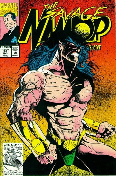
To follow up my point about idealization in more detail, I find it presumptuous that certain feminists should expect that artists should draw males and females with equal sexuality, or lack of same. John Romita Sr's work showed an unquestionable talent for drawing glamorous women, while his male characters tended to be more "neutral." Would modern feminists be satisfied if all hetero male artists drew both sexes with equal neutrality (or "idealization," as Thompson calls it)? I assume that is the goal, since I don't see any feminists demanding an equal level of over-the-top sexuality, except in a satirical context. While I can't agree with Milo Manara that these American cultural developments have anything to do with the influence of Islam, the "equity proposition" is devoted to an ideal of sameness that I deem deadly to any form of creativity, and is therefore not that far in basic sympathies from any ideology of conservative religiosity.