My last post was a little cryptic. I have done my box break and started to sort
the cards, posted a little late and well now the cat is out of the bag.
OK where to begin?
The Beginning why not?
“A long time ago in a
galaxy far, far away…” OK Wrong beginning.
Some weeks ago I got a surprise email from one of Upper
Deck’s Marketing people. It began with a short introduction and then the
attention grabbing
“I wanted to reach out
to you because I love what you do regarding your Upper Deck card set.” I’m
not sure exactly which set is being referenced or what special thing I did to
get on the marketing department’s RADAR. I just hope I stay there so I can get
more goodies. (Topps, Rittenhouse and Panini would be Super as well)
Anyway continuing…
“We would love to
connect with you regarding some other sets including 2015 Upper Deck Canadian Football League, 2015 UD Turkish Airlines
Euroleague Basketball, and 2015 UD USA Football...I have a couple extra media
review copies and wanted to see if you would be interested in receiving one
each as long as you would write something up on the product to share with your
audience.”
I replied positively to the email and included my mailing
address. A few weeks later, on Wednesday 23 December 2015 the Eve before Christmas
Eve I got my package from Upper Deck. In a sea of pale pink packing peanuts was
this fine hobby box of 2015 Upper Deck
Canadian Football League cards 24 packs with 6 cards per pack. Those other
products would be fun to bust as well, but Oh well.
Since there are 24 packs I will have to post the
pack-by-pack listing separately to keep this from being too long a post.
First off I really enjoy this product mostly for its
simplicity. My box breaking experience has some positives and negatives that I
will cover with this post.
I like the plain simple
design with the bottom corner framing and the opposite corner flush with the
edge. I am glad there is no annoying silver or gold foil that is impossible to
read. Sadly there is some white lettering on silver background where the
player’s position is listed.
The front of the base cards has a large
picture of the player mostly in-game action shots. The Upper Deck logo is in
the upper left corner and the top and left sides of the card the picture hits
flush on the edge for the
“full picture” feel. The Right hand border is a white
background with some light gray/silver shadowing and some team color hashlines
top and bottom with the player’s position in white lettering (hard to read and gets
lost) in both English and French. The bottom edge has a border that matches the
teams main color with the Player’s name in white letters (the name could be a
bit bigger) under the player name is his team name in gray/silver, very tiny a
bit harder to read than the player’s name. And in the right hand corner of the
colored border is the team logo.
The back is pretty standard they repeat the head/bust part from the front picture. There is some matching of team colors with the general design.
Most of the base card fronts are regular portrait
(vertical) orientation, but there are a few landscape (horizontal) oriented
card fronts, the backs are all portrait. The Checklists have two players on the front in the landscaped
orientation, with the checklist on the back in regular portrait orientation. I am glad there are no multi-parallels, and that the number of insert sets, are kept to a minimum.
The inserts sadly don’t list the team names, but do have the
team logos on the fronts. There are two main insert sub-sets “All-Stars” and
“Star Rookies”. Oops those are also base cards. Well they have a slightly
different look so I mistook them for inserts they are actually two “sub-sets”
within the main base set numbering.
The All-Star Cards divided in their coloring by East (red
border) and West (blue border) Divisions. The color border runs along the top,
left and bottom edges with the right side having the player’s picture flush
against the card edge. Again the Upper Deck logo is in upper left corner. Top
right of the card kind of hard to read is the Division (East or West). Left
side again in tiny lettering is the player’s position. On the bottom is a
gray/silver banner with All-Stars in black lettering with the player’s name in
white lettering underneath, and team logo on left hand side. Oh and I just
noticed the player’s number in the bottom right corner how nice, didn’t see it
before.
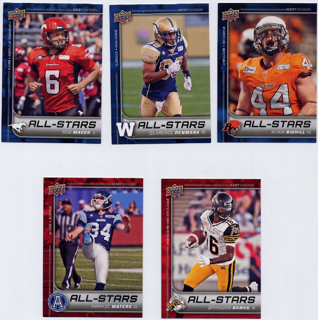
Backs are nicely done, except nowhere is the team name actually written
out, just the team logo on front. After opening a few packs I got used to the
various teams. I don’t follow CFL as closely as I do the NFL so I am not as
familiar with the 9 teams in the league. I really wish they would do some
expanding and have 12 teams to make things a little more exciting.
The Star Rookies cards again follow the regular base card
team colors design. The front player picture is flush with the top, bottom and
right edges the left edge has a color bar that matches the player’s team
colors. The usual Upper Deck logo in left corner Star Rookies reading bottom to
top vertically along the bar and team logo bottom corner. Player’s position
reads “under” the Star Rookies “banner” along with a series of stars. The
player’s name is in silver across the bottom. Team name not listed just team
logo in corner.
Back looks like the regular base backs.
The Retro O-Pee-Chee cards remind me of a cross between the
2009
Philadelphia
retro cards and 1960s cards. They have an all white border, the upper left
corner has a retro looking OPC logo, The player’s photo outlined in white
against a solid color background. The player’s name is in white letters on a
black bar above a white bar with the player’s position in black. The team logo
is in the bottom right corner. The team name is not mentioned.
The back is raw
cardboard brown with black lettering. I really like this insert set and plan on
building it.
Here are my basic totals from the box:
Totals:
23 White Blank Decoys: So one in each pack without a hit.
145 cards (1 extra)
Base: 134: A full set is 200 cards so you need at least 2
boxes to maybe get a full set. Due to the randomness there is no guarantee of
that even.
Protrait/Vertical: 120
Landscape/Horizontal: 14
5 All Stars: Average 6 per box
7 Star Rookies: Average 6 per box
10 Duplicates
Inserts:
9 O-Pee-Chee Retro inserts: Average 8 per box.
1 Grey Cup Moments
1 “Hit" Game Jersey: Average is 2 per box but not
guaranteed
13 Miscut cards - That is way too many. They fell mostly in
the second half of the box
8 in 4 consecutive packs and then later 5 more in 2 consecutive
packs.
(Miscut cards Shown here fronts and backs)
All-in-all I liked breaking this box. It is a fun product.
Being a football fan that is more NFL than CFL it did teach me a few things, or
reminded me of a few things. Like a fave homie player that I had forgotten plays in Canada now. Let’s see the positive:
- Nice
design. Not to busy or complicated. Some little reading problems but not
like the years when silver or gold leaf/foil is used
- Bright
colors in design. Very few variants in design features
- Inserts
fun and also bright colorful designs
- OK
correlation, low percentage of duplicates
Now the negative:
- Player
position very difficult to read with color design
- Insert
cards don’t mention team name, only show team logo
- My box
had a very high percentage of miscut cards. 13 total from 6 packs
- Player
vitals read vertically
- Back
picture takes almost the full top half of back and is duplicate of front
picture (I don’t mind that too much but some people do)
I will keep a handful of the base cards, the Brandon Banks
cards because he was a Redskin, and one of the best punt returners they ever
had. They never should have gotten rid of him. I am also keeping the OPC Retro
cards I plan on building that 50 card set. I will be trading or giving
away most of the remaining cards.
My next post will have the pack-by-pack play-by-play and
will show some of the cards I didn’t show here.