Doug: Loving all of these guest posts -- just loving them! Hey, today Mike S. (aka Martinex1) is back with another Open Forum on one of the all-time greats, the Flash! Although the Scarlet Speedster has made a few appearances on the BAB, he's certainly not received his due given the long history of the character. Today's a step in the right direction. And, as you read through this, note how ol' Mike/Martinex is playing the same riff our "
Paint It Black" covers post of a few weeks ago was blasting!
Mike S.: I have been watching the new Flash television show and have
been surprised by how much I enjoy it. It is definitely light fare, and in tone it probably leans more toward the
action adventure shows of the late 70’s (threat of the week, cast of supporting
characters, romantic undertones, episode bridging mystery, etc.) rather than
the dark mood and cynicism of more recent primetime shows. One aspect I like is that the creators are
not shying away from its comic book genesis and are embracing some of that
genre’s inherent oddities and drama.  The template for the show seems to be to throw in everything and the
kitchen sink, keep it all generally good spirited, and keep it moving.
The template for the show seems to be to throw in everything and the
kitchen sink, keep it all generally good spirited, and keep it moving.
Introduce a new rogue nearly every
week? No problem. Actually
present Grodd, a telepathic genius gorilla? Sure why not. Name drop many of
DC’s characters and hint at future subplots?
There are easter eggs galore. How about time travel? Throw
it in; mix and stir.
I have always known Barry Allen’s Flash origin and cannot
even tell you when I first heard about the crash of chemicals and lightning
strike; that story must have somehow been ingrained in me by the time I could
read. But I have never owned many Flash
comics. If I said I have five Barry
Allen issues that may be exaggerating. I did follow Wally West’s adventures a bit in both Teen Titans and his
own series, but I cannot recall much detail.
With my newfound interest in the Flash because of the
series, I decided to look at some old Silver and Bronze Age covers to see what
I may be interested in reading. I was
surprised by a style and motif in the cover art that is the polar opposite of
what I envisioned. Interspersed
throughout the years, particularly in comics dated 1966 through 1974, there are
some interesting concepts that I don’t think I have seen used much
elsewhere. Although sometimes touched
with Silver Age insanity (i.e. Barry’s head growing to the size of a watermelon
in issue #177), there was a serious edge to the Flash. There was a type of grimness that I would
have thought common in Batman, but in my limited exposure to the Flash would
not have expected. And some of the
design is better and more cutting edge than I realized. Certainly Marvel did not often employ this
vibe in its superhero standards at the time. I am not a DC aficionado so I am not sure if this was the house style
and would be interested in hearing others' thoughts on the topic.
Here are some of the details around that styling and some
examples of issues I am referring to:
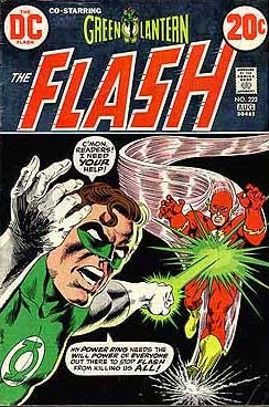
1) The covers broke the fourth wall. It seems fairly common for the character on
the cover to address the reader. Whether
featuring the Flash himself or the villain of the issue, the cover challenges
the customer to purchase or even partake in the adventure. See issues #163, #172, #193, and #222 for
examples. This of course was long
before series like She-Hulk by John Byrne commonly employed this tactic of
self-awareness. I think this was rare
in the Bronze Age (it was a dated technique in some regards that lost its
appeal, but seems somewhat novel in retrospect).
2) The text itself was part of the cover’s
appeal. See Issues #174 and #184. The logo in #174 is so eye catching and
seems like a technique that Steranko or Eisner would use.
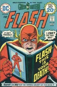
3) There was an element of fear or tonal darkness
to the covers, often including the Flash’s death and stark black
backgrounds. Some covers would almost
seem appropriate in a horror anthology like “Unexpected”; the only differentiation
is the brightness of the Flash’s costume. Check out Issues #186, #190, #191, #194 and
#227.
Each of the above covers intrigue me. I have no idea if the stories inside are
any good at all, or if the atmosphere changes at all. But I like these covers and I have to say I
want to read them. If I had been buying
comics at the time of their release I would have purchased these comics. The artists for the instances shown include
Ross Andru, Nick Cardy, Neal Adams, Carmine Infantino, and Joe Kubert. No slackers there, and even the artists with
mixed reviews show nicely. It seems to
me that with such a varied group of contributors, much of the feel must have
been editorial’s choice. It is hard to
say for sure. The coloring of the
books had a large impact. The Flash’s
costume is a classic and hasn’t changed much in the fifty plus years of
existence. The red and yellow are so
striking particularly against dark backgrounds, so I am sure that contrast led
to some of the decisions. But the stretching
of the art form and the forbidding aura add a complexity that I was not
expecting from that era’s scarlet speedster comic.
What do you think about the Flash? Do you like the new television show? And what is your opinion about the cover art I
mentioned? Did the stories match their
covers’ appeal? Was DC pushing any boundaries with this title
or were they always chasing Marvel? Did
other DC books share this approach or was it limited to the Flash? Do you prefer Barry Allen or Wally West? What are some great Flash stories? What else did I miss that was just plain
Flashtastic?